Log Book
Embassy Opening
Wed. Oct 19th. 3PM CET
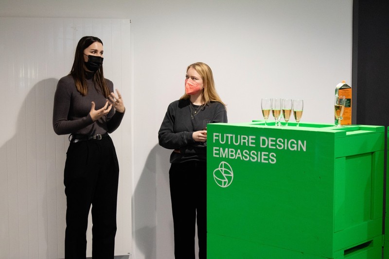
Finally the Future Design Embassy of Folkwang has opened – A place for transfer, research, experimentation and intercultural exchange for future designers.
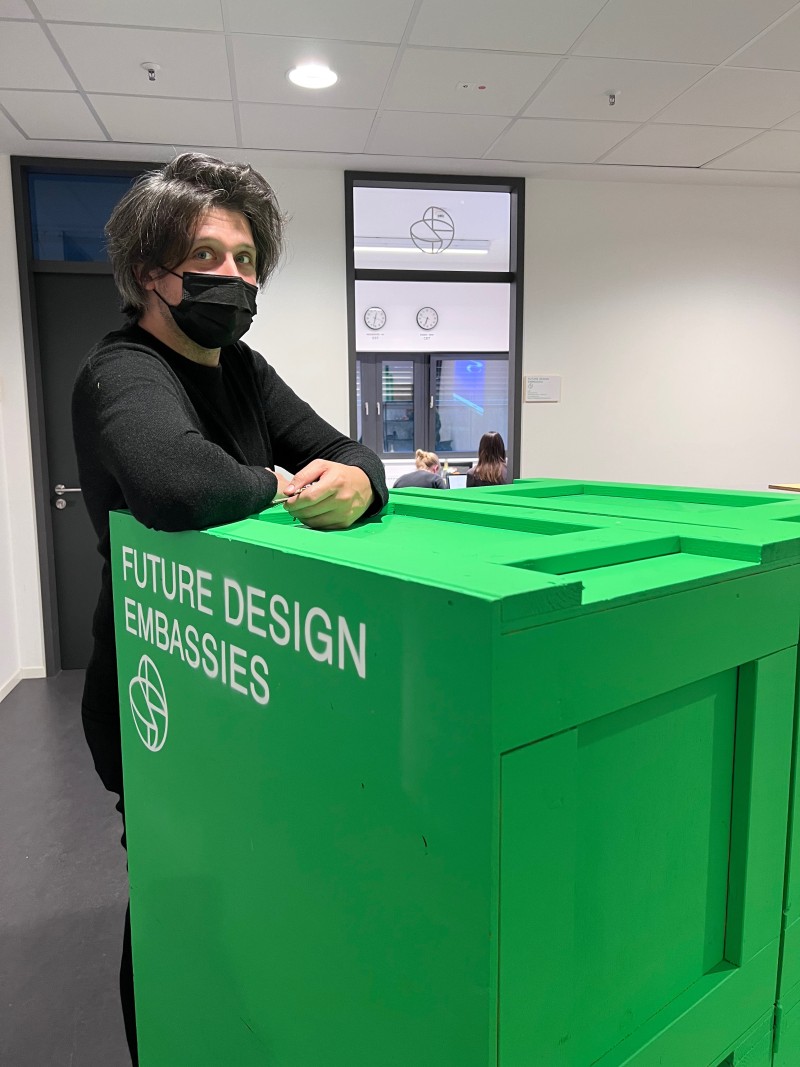
The Folkwang Embassy Team, Karen Druebert, Marion Digel, Sebastian Goldschmidtböing and the first …
Wed. Oct 19th. 3PM CET
Finally the Future Design Embassy of Folkwang has opened – A place for transfer, research, experimentation and intercultural exchange for future designers.
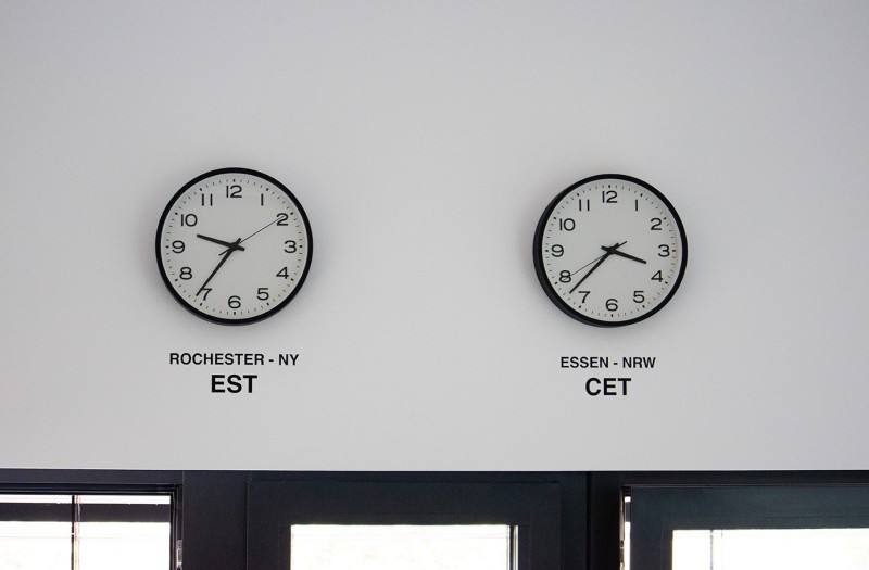
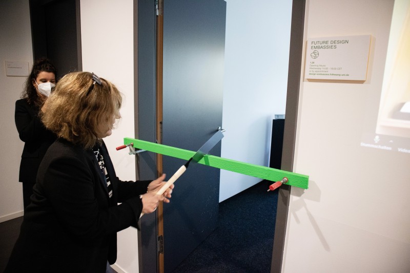
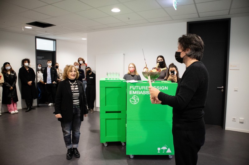
The Folkwang Embassy Team, Karen Druebert, Marion Digel, Sebastian Goldschmidtböing and the first two student ambassadors, Celina Kroder and Alina Rogge celebrated the embassy opening with the American partners from RIT, Josh Owen and Juan Carlos Noguera, who were in attendance via Zoom. Guests were students and faculty from the Folkwang Industrial Design departments, Product Design and Design Futures.
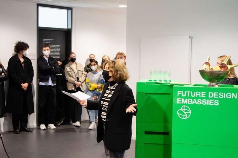
Project Director of the Future Design Embassies, Marion Digel welcomed the guests and explained the concept and aims of the project in which international student ambassadors of both partner institutions get to travel abroad and conduct a design workshop, centered around the research topic: "Backtracking Modern Times. Are the ideas of Modernism sufficient to solve 21st Century problems?" She also talked about how intercultural exchange, dialogue, openness, relevance and sustainability are essential for the program as well as for our global society.
After that Josh Owen and Juan Carlos Noguera introduced themselves and their institution and sent their greetings.
Celina Kroder and Alina Rogge introduced their workshop " Light and Liminality" which will take place at the Vignelli Center of Design Studies at RIT Nov. 7th - 11th 2022.
The embassy was opened with a Japanese saw and a balloon powered car didn't quite make it as the solution for future mobility :-)
Then the opening was toasted with sparkling wine and snacks. Good fortune to the project!
The project Future design Embassies – international student ambassadors is sponsored by the "Stiftung für innovative Hochschullehre".
Sept. 6-11th – At the Vignelli Centre for Design Studies
Meeting with Josh Owen, Distinguished Professor of the Vignelli Centre for Design Studies.
Introduction to the premises at RIT and the VCDS. Lunch and A little Campus Tour…
Observations:
Since I have last been to RIT there are new additions - A …
Meeting with Josh Owen, Distinguished Professor of the Vignelli Centre for Design Studies.
Introduction to the premises at RIT and the VCDS. Lunch and A little Campus Tour…
Observations:
Since I have last been to RIT there are new additions - A large new Library is being built and the new RIT MAGIC Spell Studios for film making. Also one can see many campaigns featuring sustainability projects, inclusive programs such as Black Lives Matter and other campaigns regarding ethical topics of our times. Obviously the awareness for these is very high in the academic context at RIT.
Back at the VCDS Josh Owen hands me the key for an office space at the VCDS, which will be the RIT Future Design Embassy! We talk about the project and how we can organize the Workshop, which our International Student Ambassadors will conduct in the beginning of November.
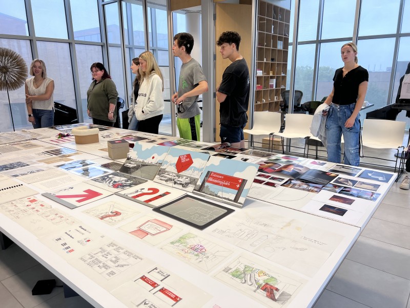
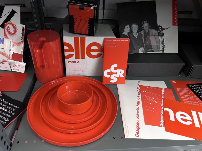
At 2 pm. The Archivist Jennifer Whitlock receives a group of visitors for the open day exhibits at the Vignelli Centre for Design Studies. She has layed out some the most prominent treasures of the archives and the visitors ask questions about original drawings, preliminary models and many more examples of the Vignelli’s Work. There are the CIGA Hotel glass- and flatware, the New York Subway Maps, the Corporate Design for American Airlines and the Vignelli’s Garment-Collection, just to name a few.
Observations:
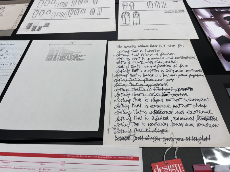
Visitors and students are impressed with the broad scope of the Vignelli’s work and with the diligence and concentration of their design processes. This is especially apparent in their hand- drawings which show how good visualization helps to form the transformation from the idea to the product.
The Vignelli’s drawings (mostly Massimo Vignelli’s drawings) mirror their trains of thought and make their design decisions very accessible and transparent to their clients, their partners (like engineers, etc.) as well as to students and scholars today. One student said: “It is amazing how the sketches come already so close to what the product will look like, only with a few lines!”
In regard to our question about the application of modernist ways of working in design towards designing within the challenges of the 21st century, this process of drawing by hand is certainly a tool which is most useful today and should be further cultivated in design education. It produces more than just nice pictures but ways to think, to understand and to grasp complex situations – from the hand to the mind. It might be more important now than ever, as a contrast to the non-linear modes of operating in the digital world.
Sept. 7th.
Day of the screening of documentary “Design is One” about the Vignelli’s and their work directed by Kathy Brew and Roberto Guerra.
This is a great day culminating into the film screening of the documentary “Design is One” and a panel talk afterwards in the evening. I consider myself happy spending it with the New York Filmmaker Kathy Brew at the VCDS and over lunch at a little restaurant right on the beautiful Eerie- Canal. Our conversations evolved around how making this documentary about Lella and Massimo Vignelli came about and how it affected her as a filmmaker. We also talked a lot about the roles of women in design and in filmmaking and about husband / wife collaborations.
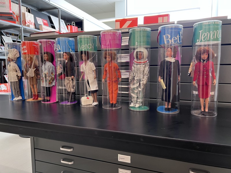
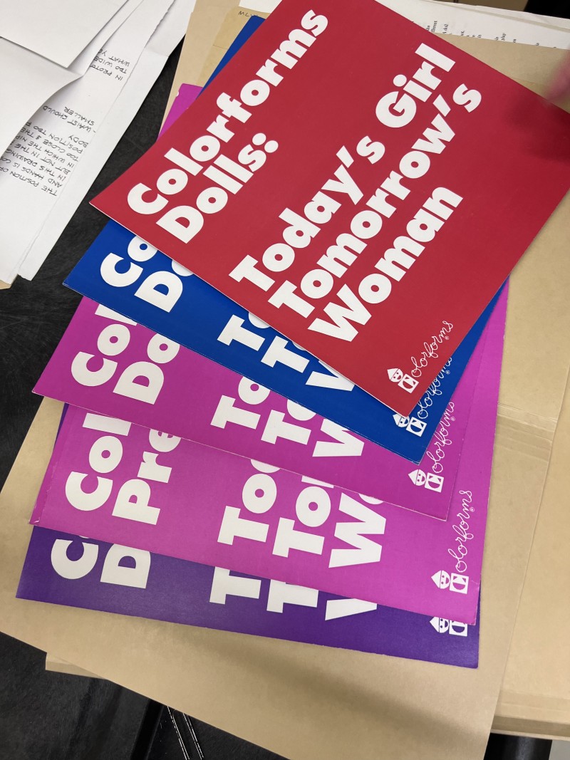
In that context I remembered the dolls which Lella Vignelli designed in the Eighties of the 20th Century with the title “Today's Girls- Tomorrow's Women”. Since Kathy didn’t know about those yet, back at the archives, we asked Jennifer Whitlock about them. Jennifer found them straight away, not just the prototypes but also the drawings and correspondence of Lella Vignelli with the producer about her intentions. The dolls, contrary to Barbie, depict that girls could be whatever they wanted to be- a doctor, a judge, an astronaut or even a president. Lella made sure the dolls would have more realistic features than Barbie, that they could stand on their own two feet and that they were diverse.
Observations:
Again, this shows the value of a well sorted archive with first hand material for scholars, when trying to understand the intentions of designers. We didn’t have to speculate about what Lella’s thoughts on the role of women in society should be, we could read them in her own words.
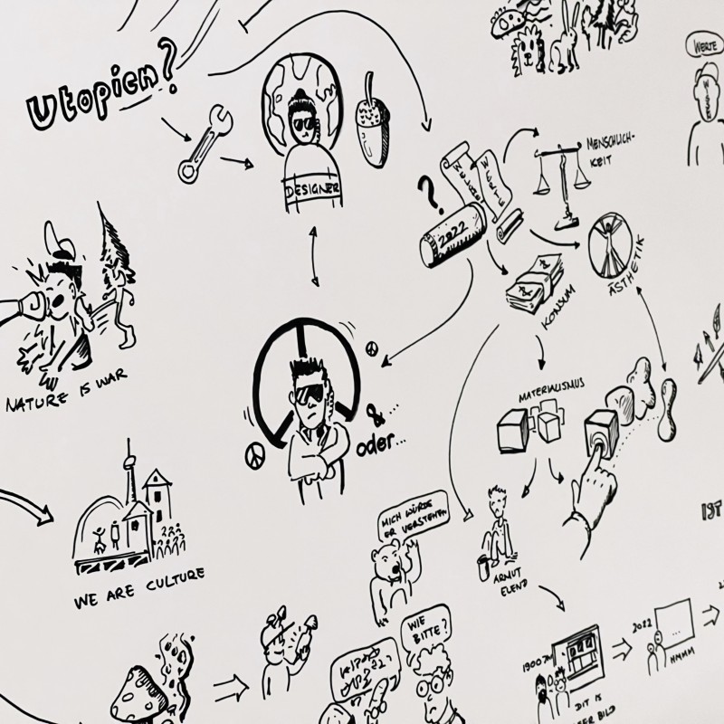
VDID Focus. On. Create Utopia
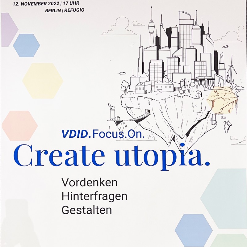
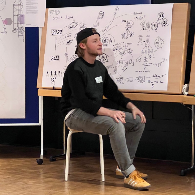
This conference hosted by the VDID in Berlin in the context of the New European Bauhaus, invited participants to create Utopias for the year 2222, Utopia meaning a positive narrative of the future. Under the initiative of Frederike Kintscher a …
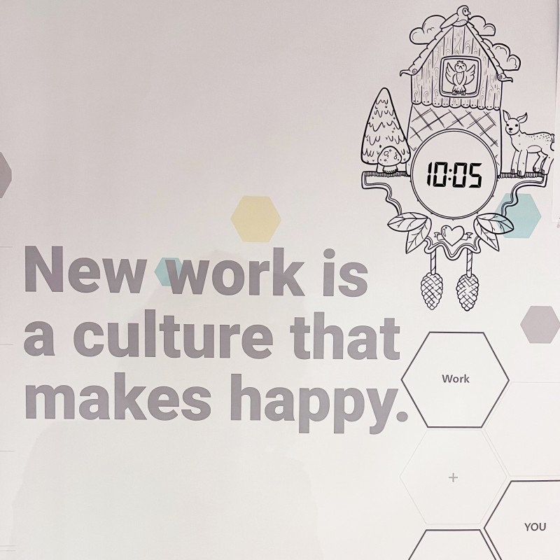
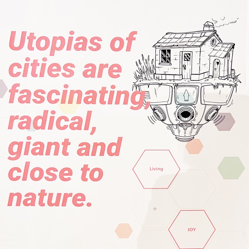
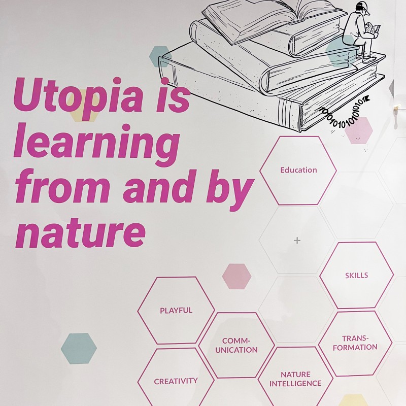
This conference hosted by the VDID in Berlin in the context of the New European Bauhaus, invited participants to create Utopias for the year 2222, Utopia meaning a positive narrative of the future. Under the initiative of Frederike Kintscher a VDID working group drew up a concept calling to action “…to outline desirable Utopias for Mankind. To make them tangible, valuable and lovable.“
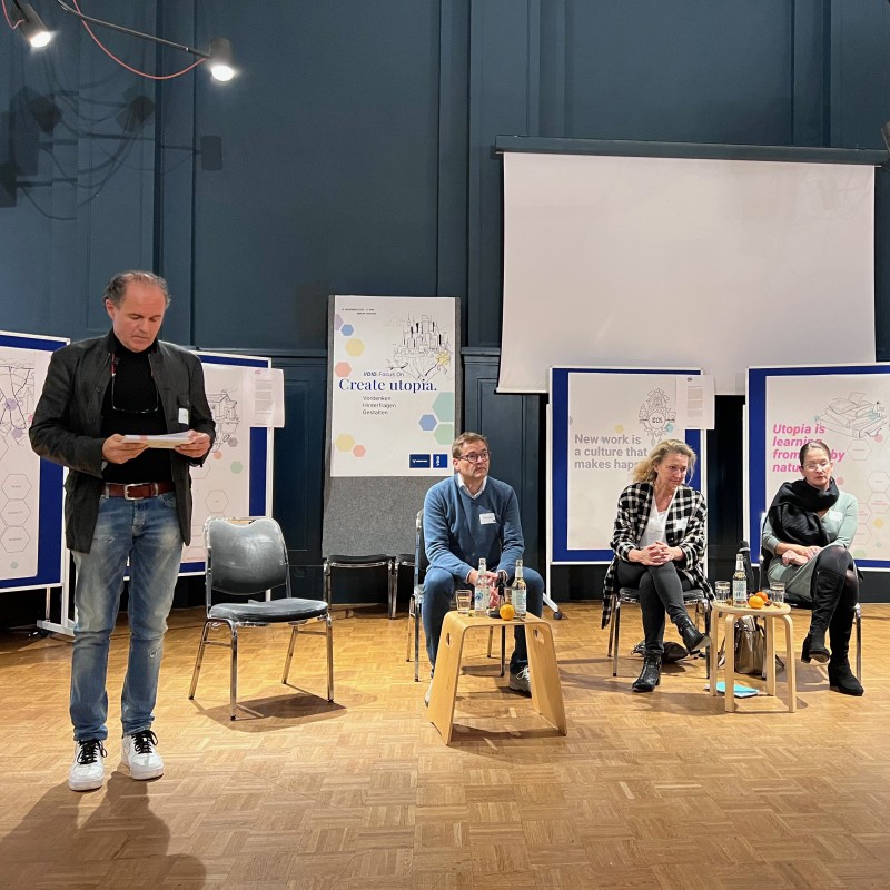
The panel, consisted of Stefan Eckstein (Eckstein Design, Munich) as presenter, Dr. Sibs Bauer (Designkunst, Hamburg), Stefan Lippert (UP Designstudio, Stuttgart) and Manja Unger-Büttner (Technical University Dresden). The discussion started out with the questions of values for 2222 and soon exploded into a very lively discussion between the panel and the audience.
I haven’t experienced a discussion that was this lively, full of serious engagement, controversy and humor, in a long time. This was probably due to the aim at the year 2222 which far enough away for us designers to get out of our problem solving mode and enabling to let our ideas fly. Thus a positive narrative was created instead of a dreary dystopian future. This really offered perspectives, not only for designers.
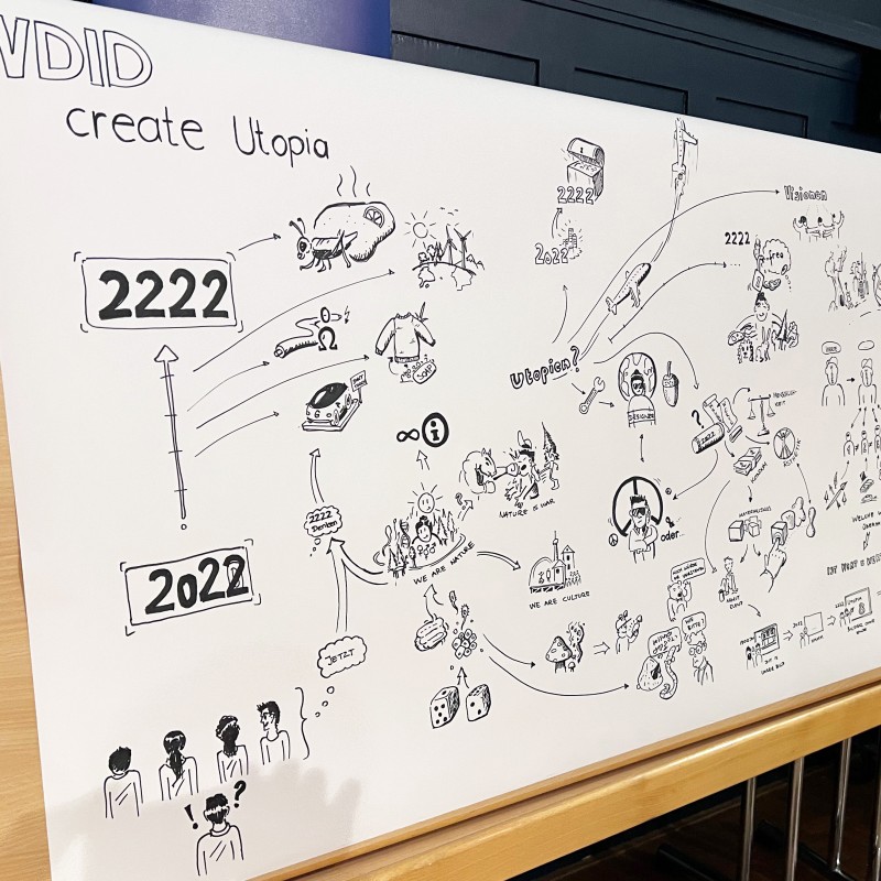
The discourse was accompanied by a young designer who put what was said into drawings, transferring words into visuals and thus achieving another level of communication.
Great Work! Great Event!
https://www.vdid.de/verband/projektgruppen/
https://new-european-bauhaus.europa.eu/index_en‚
Roadtrip from New York City to Rochester – MANITOGA
Sept. 5th
Roadtrip from NYC to Rochester with a visit of the The Russel and Mary Wright Design Gallery at Manitoga (Garrisson NY) on the way.
Russel Wright (April 3, 1904 – December 21, 1976) was an American industrial designer. His …
Sept. 5th
Roadtrip from NYC to Rochester with a visit of the The Russel and Mary Wright Design Gallery at Manitoga (Garrisson NY) on the way.
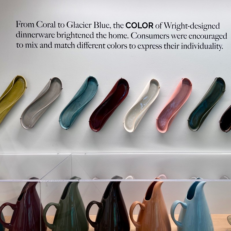
Russel Wright (April 3, 1904 – December 21, 1976) was an American industrial designer. His best-selling ceramic dinnerware was credited with encouraging the general public to enjoy creative modern design at table with his many other ranges of furniture, accessories, and textiles. The Russel and Mary Wright Design Gallery at Manitoga in upstate New York records how the "Wrights shaped modern American lifestyle".[1]
https://en.wikipedia.org/wiki/Russel_Wright
12.00 pm Tour of the premises.
Observations:
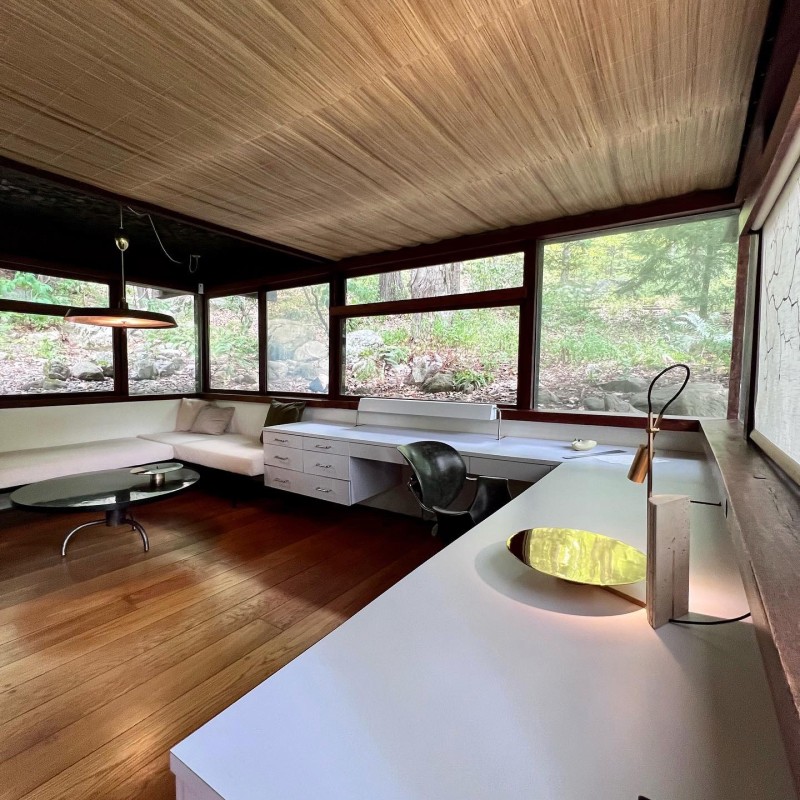
Manitoga (Place of Great Spirit, Algonquin) was Russel and Mary Wright’s summer house for which they designed and constructed the landscape with trails, avpond and waterfall as their city escape. The design of the house and Russel Wrights studio “Dragon Rock” which he realized with the architect Davit Leavitt, stands for his modern ideas, aiming at simple, minimalistic structures and the integration of nature and architecture. The way the houses are set into the rock and the forest with their green rooftops, they seem to grow out of the landscape very unobtrusively. The rock being the wall of the house on one side and the natural floor in other parts of the house and the floor length windows, opening up to nature, underline this impression. *
“The house is both, a statement of blending and of contrasting…by blending I mean that the rocks, boulders and even the trees are brought into the house. For contrasting the rectangular shapes of the windows contrast with the organic pattern outside.” Russel Wright
https://www.visitmanitoga.org/russel-wright-and-manitoga/studio-guest-room
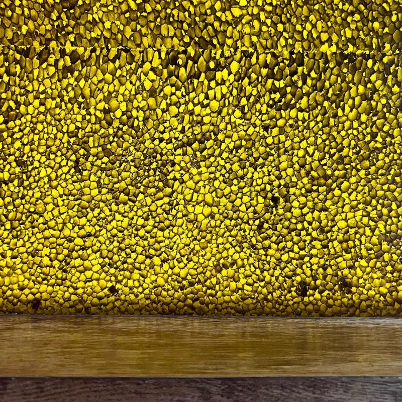
It is very unique how Wright integrates nature with man-made materials. He uses natural elements such as pine needles, butterfly wings and conserves them in state-of-the-art plastic materials of the time. He also combines natural wood with new then materials such as FORMICA in the furniture. All in all, Russel Wright succeeded creating a statement of blending and contrast as he intended.
The currently exhibited work by the Italian/Dutch Designerduo Formafantasma (Andrea Trimarchi and Simone Farresin) complements the intentions of Wright. They put together a carefully curated, site-specific installation of their work, which consists of design objects mostly made from organic materials such as a chandelier made from cow bladders or vases and jugs wrapped in animal skin. The installation creates a very subtle dialogue with its surroundings and with the modernist statements by Russel Wright.
Sept. 5th
19.30 pm – Arrival at the Hotel in Rochester.
First shock –the lobby is airconditioned to a temperature like in a refrigerator, at the same time there is a fireplace running with a gas fire – what? Don’t they realize that there is an energy crisis and climate change? This brought me back to reality after experiencing the eco-awareness at the Russel Wright House.
A Topic for DIALOGUE?
Open Day at the MOMA
Observations:
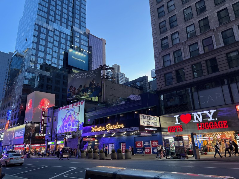
Walking in the city – New York is just as hustling and bustling on this Labor Day weekend as before the Covid Pandemic. New York has come alive again!
16 pm- 19.30 pm
Open day at the MoMA – …
Observations:
Walking in the city – New York is just as hustling and bustling on this Labor Day weekend as before the Covid Pandemic. New York has come alive again!
16 pm- 19.30 pm
Open day at the MoMA – Free entrance for New Yorkers – I have never seen the MoMA this crowded!
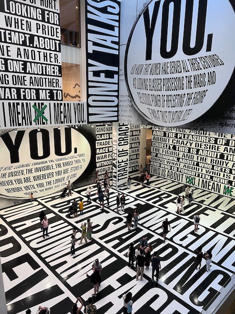
The exhibition “Thinking of You. I mean me. I mean you.” By Barbara Kruger was very impressive. To me it was better than her exhibition at “Neue Nationalgalerie”, since the high wall space at the MOMA gave you the impression of literally being inside these overpowering text messages. Her use of space, proportions and contrast make her messages so powerful.
“I try to make work that joins the seductions of wishful thinking with the criticality of knowing better,” Barbara Kruger has said. An incisive critic of popular culture, Kruger addresses the viewer directly as a way of exposing the power dynamics underlying identity, desire, and consumerism. Kruger’s large-scale commission for MoMA will envelop the Marron Family Atrium with the artist’s bold textual statements about truth, belief, and power.
moma
At the MoMA Sculpture Garden there was a nice, relaxed gathering of many New Yorkers having drinks and listening to the sounds of local DJs. A great place to witness just how divers, colorful, crazy, expressive and lovable New Yorkers can be!
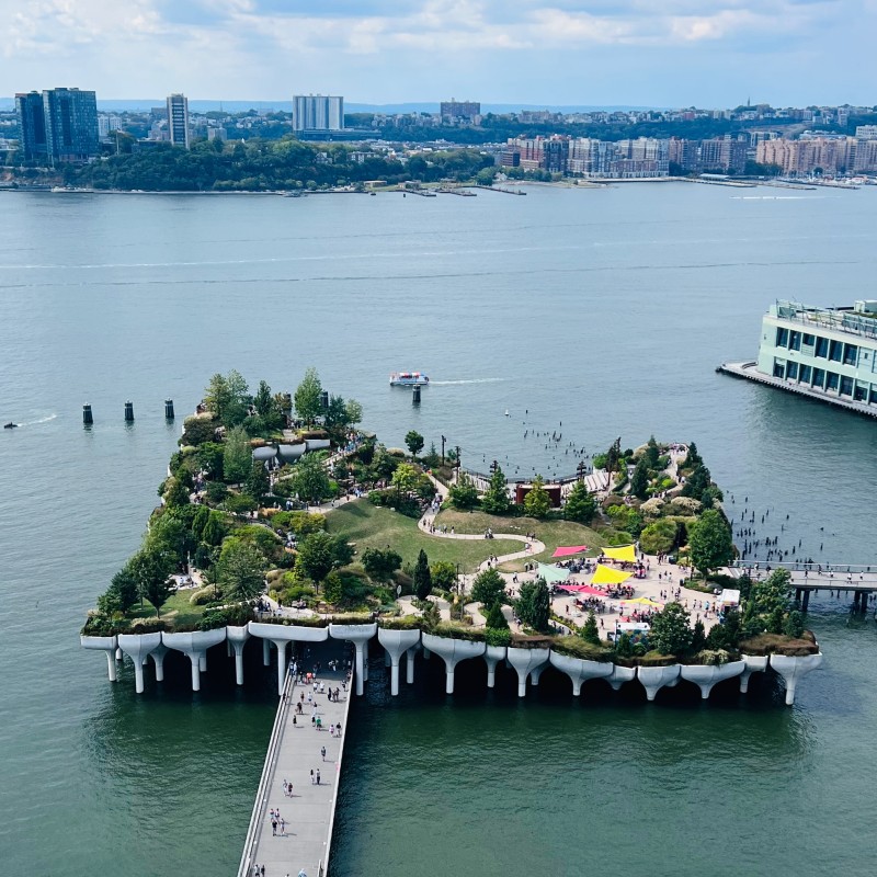
Sept 3rd – New York City has a new “Little Island” at Pier 57!
“What was in my mind was to build something for the people of New York and for anyone who visits—a space that on first sight was dazzling, and upon use made people happy.”
Barry Diller
„My studio and I became interested …
“What was in my mind was to build something for the people of New York and for anyone who visits—a space that on first sight was dazzling, and upon use made people happy.”
Barry Diller
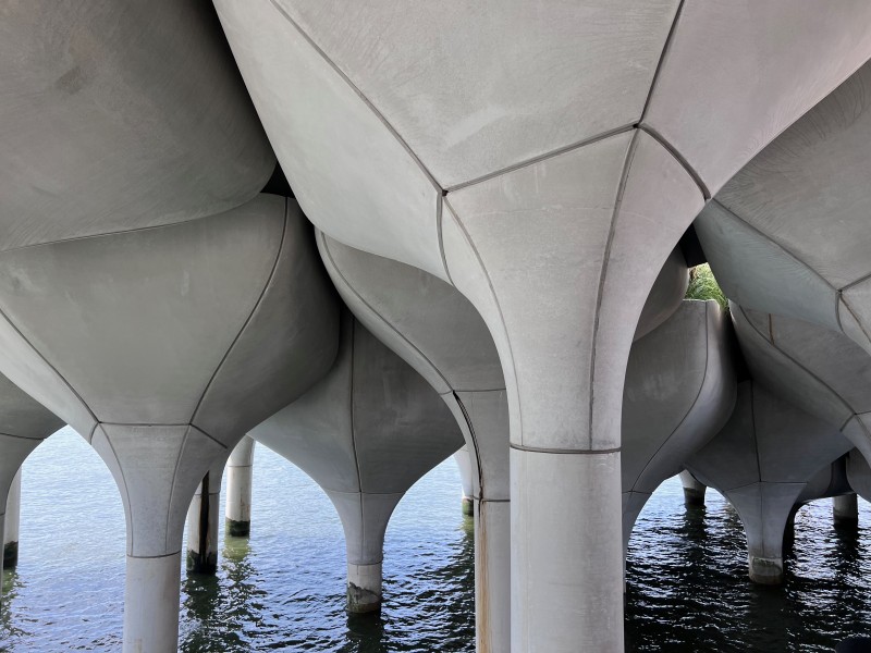
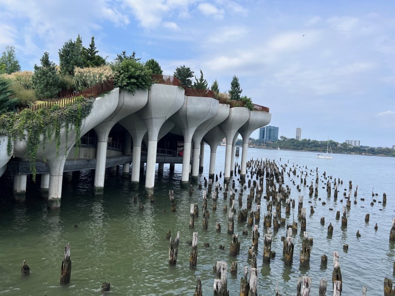
„My studio and I became interested in the remains of the old piers on the west side of Manhattan, where their top surfaces had long gone, leaving only hundreds of ancient structural wooden piles sticking out of the river. We wondered if the identity of our new park and performance space could emerge from the water, just like these structural piles, but without needing to add any slab on top. This idea evolved to take the new concrete piles that would be needed to connect to the granite at the base of the river, and to then continue them out of the water, extending skyward to raise sections of a generous green landscape with rich horticulture. Fusing at they meet, these 280 individual piles come together to form the undulating topography of the park, angled perfectly for performance and theatre spaces. Once complete and open to the public in 2021 the result should be a unique and thrilling landscape over the water for everyone to enjoy.“
Thomas Heatherwick, Founder Heatherwick Studio
Observations:
It seems to be a bold idea using those concrete piles for the cultivation of horticulture and trees.
They appear to be huge flowerpots with the stilts funneling into the Hudson. I hope the concrete material can sustain the growth of roots and the water for a long time!
I love New York!
Sept. 1st-5th.
I Love New York!
Observations: Arrival at Newark on Sept. 1st
View of the skyline of New York from the immigration hall. – There are new skyscrapers!
“Super-skinny skyscrapers, or pencil towers, have begun rising in New York City …
Sept. 1st-5th.
I Love New York!
Observations: Arrival at Newark on Sept. 1st
View of the skyline of New York from the immigration hall. – There are new skyscrapers!
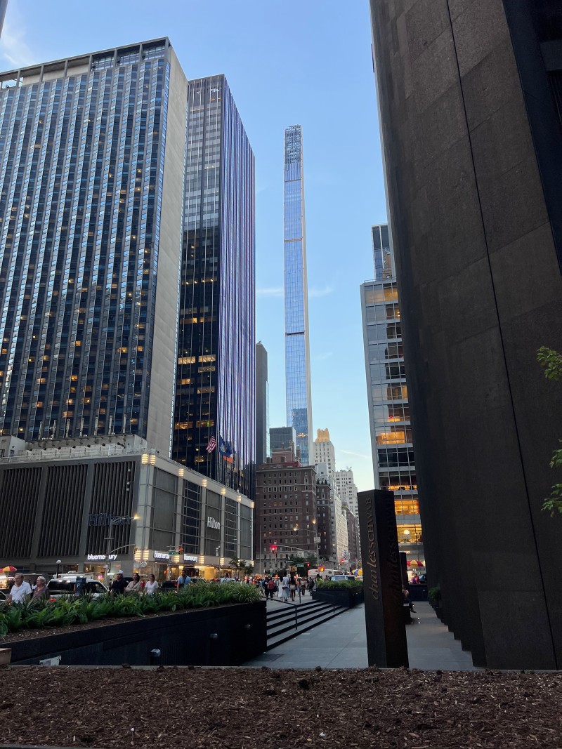
“Super-skinny skyscrapers, or pencil towers, have begun rising in New York City over the past decade with SHoP Architects' 111 West 57th Street recently becoming the skinniest skyscraper in the world.
Although there is no official ratio to determine whether a skyscraper can be called super-skinny, they are generally considered to be at least 10 times as high as the width at its narrowest point.
With a highly competitive real estate market and a demand for luxury condominiums in New York City driving demand, advances in concrete and steel, as well as the use of weights to counteract the effects of the wind, have made these constructions possible.“
https://www.dezeen.com/2022/04/13/super-skinny-skyscrapers-new-york-city/
My two favorites:
111 West 57th Street by SHoP Architects (2022)
Completed March 2022, 111 West 57th is the skinniest skyscraper in the world with a staggering ratio of 24:1. https://www.dezeen.com/2022/04/13/super-skinny-skyscrapers-new-york-city/
Observations:
I like its beautiful proportions and its very clear formal structure and that it narrows towards the top but only on one side unlike the skyscrapers of the early twentieth century. It has a modern, very contemporary look. While it offers a great quantity of living space it doesn’t need much ground space. It has a look of timelessness, without following a certain style. It seems as if it belongs there.
elene by Foster + Partners (2019)
A 63-storey skyscraper next to the Mies van der Rohe-designed Seagram Building in Midtown Manhattan was designed by British architecture firm Foster + Partners to contrast its neighbor.
"In contrast to Seagram's dark bronze, our tower will have a pure white, undulating skin. Its proportions are almost impossibly slim and the views will be just incredible," said Foster + Partners founder Norman Foster.
Formerly named 100 East 53rd Street, the residential tower with 94 units was completed in 2019 and has a height-to-width ratio of approximately 15:1.
https://www.dezeen.com/2022/04/13/super-skinny-skyscrapers-new-york-city/
I really like how the architecture of Foster + Partners respects and almost compliments the Mies van der Rohe Architecture of the Seagram Building. Even though it is much higher than the Seagram Building, it doesn’t visually dominate it.
