Log Book
IF- Foundation – DESIGNING DESIGN EDUCATION - Learning and Teaching sciences
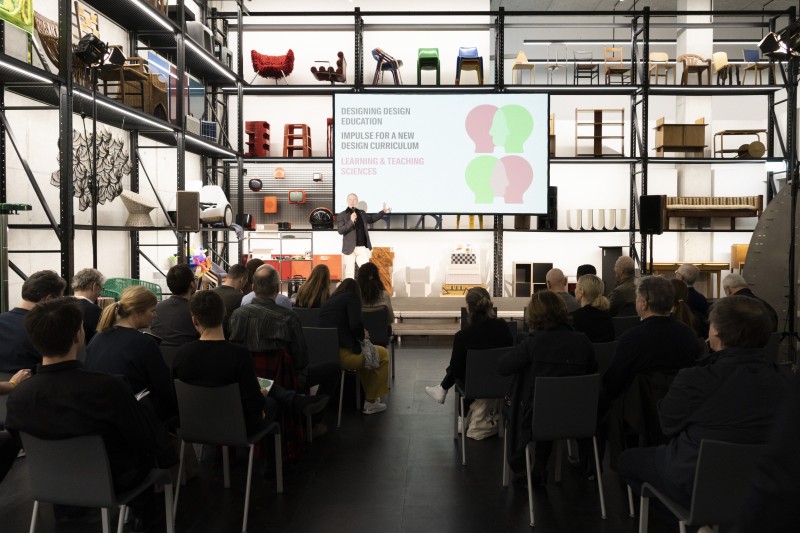
This symposium and workshops were hosted by IF Design Foundation and the Neue Sammlung in Munich. The IF DESIGN FOUNDATION, under the direction of Christoph Bönninger and René Spitz, has tackled the topic of future of design education …
This symposium and workshops were hosted by IF Design Foundation and the Neue Sammlung in Munich. The IF DESIGN FOUNDATION, under the direction of Christoph Bönninger and René Spitz, has tackled the topic of future of design education for quite some time starting with the book DESIGNING DESIGN EDUCATION they made a first attempt to find out where Design Education stands today and how it should develop in the future.
Now, in a joint project with DIE NEUE SAMMLUNG MUNICH they started a dialogue of design educators and professional designers. The symposium/workshop LEARNING & TEACHING SCIENCES took place at the X-D-E-P-O-T of the @pinakothekdermoderne in Munich, which in itself was an amazing space for this event, since it holds and showcases a large Design Collection from the beginning of the 20th century.
The impulses on learning and teaching sciences were given by:
• Prof. Colin Beard, PhD, Professor of Experiential Learning at Sheffield Hallam University, United Kingdom:
Learning Experience Design
• Larry Corio, Head of Impact Measurement at IDEO, California:
Impact Measurement
• Prof. Dr. Anna Keune, Professor of Learning Sciences and Educational Design Technologies at Technical University of Munich, Germany:
Materiality of Learning
• Blanka Tacer, PhD, International teacher trainer, Founding member of STEP Institute, Ljubljana, Slowenia:
Growth Mindset
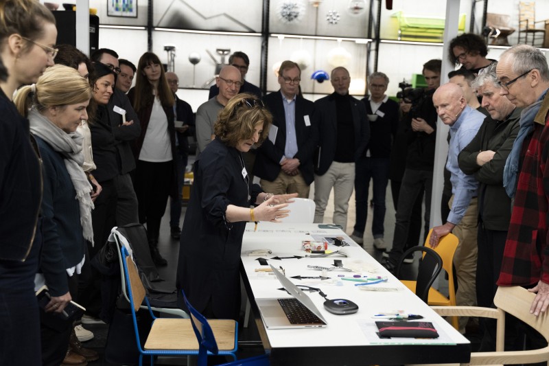
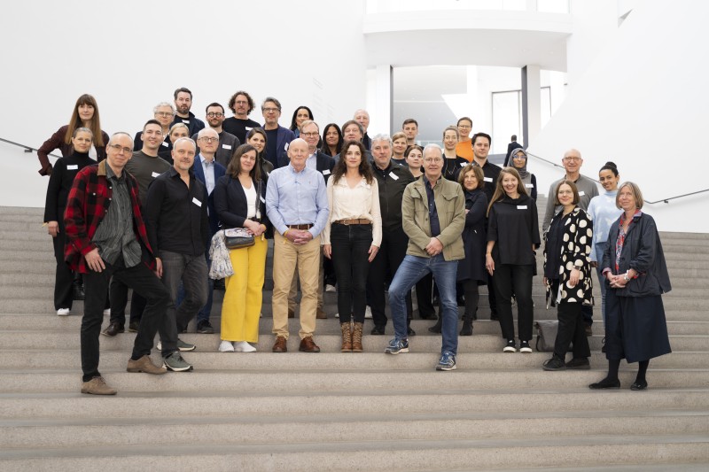
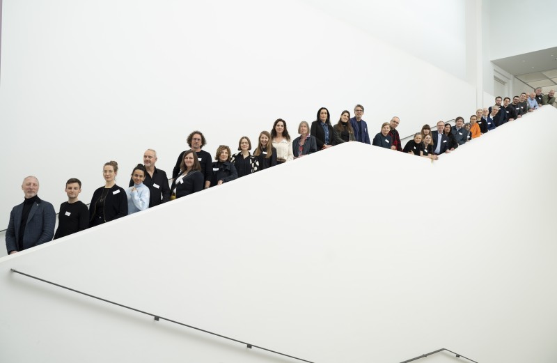
In a mix of lectures and practical workshops as well as in the dialogues among each other the participants discovered which demands of society in the 21st century would be important to their own design teaching and new approaches to tackle them.
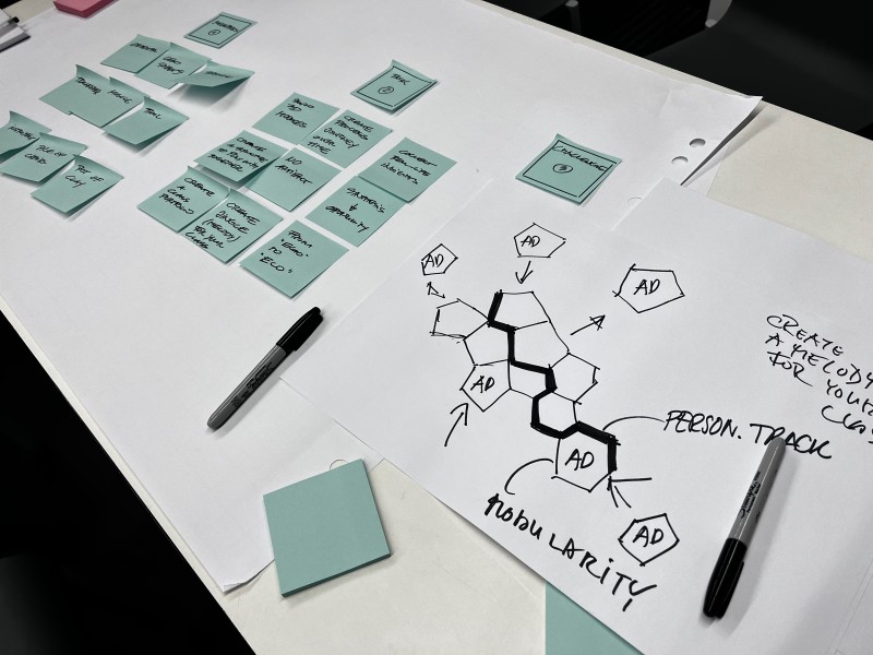
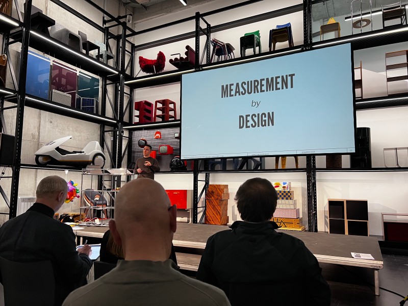
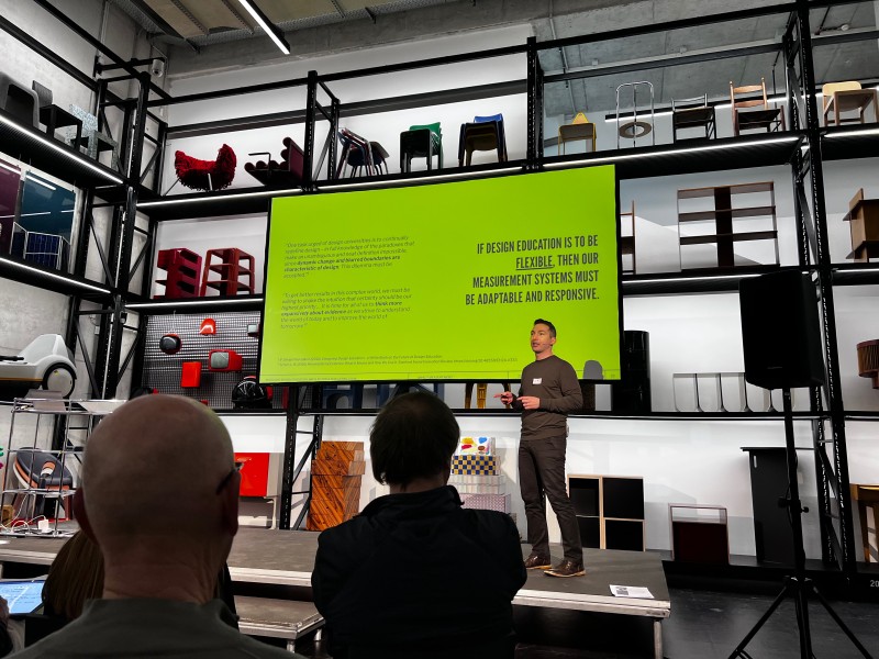
One of the approaches, which was most novel to the FUTURE DESIGN EMBASSY was the concept of IMPACT MEASUREMENT presented by Larry Corio. His method of MEASUREMENT BY DESIGN combined design practice with theory to make intuitive decisions or elements in design more tangible. So we decided to invite Larry Corio for our COFFEE + DIALOGUE session June 28th and will try to apply his method on one of our practical design projects - THE FREEDOM TORCH (more information will be coming soon!)
RETRO FUTURE Exhibition, Evoluon Eindhoven
Reality Check: How can we make sure, that speculating about the Future is more connected to present realities instead of academic aesthetic cultures?
- Sebastian Goldschmidtboeing
The exhibition RETRO FUTURE actually turned out to be a form of visualization of our research question …
Reality Check: How can we make sure, that speculating about the Future is more connected to present realities instead of academic aesthetic cultures?
- Sebastian Goldschmidtboeing
The exhibition RETRO FUTURE actually turned out to be a form of visualization of our research question »Backtracking Modern Times. Are the ideas of Modernism sufficient to solve 21st Century problems?« because the exhibition depicted the future, beginning with a modernist perspective.
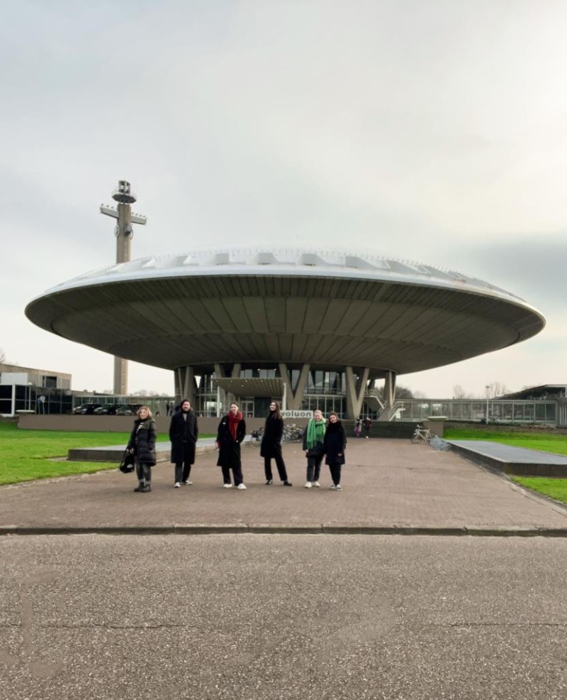
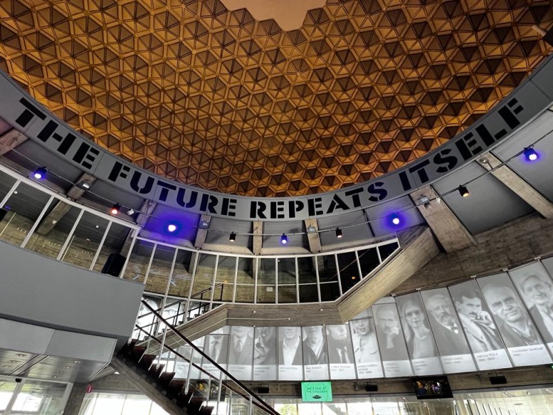
Its setting in an architectural structure which looked like a UFO (Evoluon, built in 1966 by Louis Christiaan Kalff for Philips) was a statement in itself – an icon of the »Space Age«, the time in the 20th century, during the Cold War, when the Soviet Union and the USA ventured into space and man conquered the moon. Then, people believed in progress by technology not anticipating the consequences which we are facing today, even if they knew about the risks of using too many resources or polluting the environment. People like Buckminster Fuller were looking for concepts to extend our »Spaceship Earth« into outer space. From today’s perspective though, we know that every technological revolution also brings upon new unpredictable dynamics and problems such as climate change or the destruction of species and we are not so sure about technological solutions anymore. However, we already seem to be addicts of our digital devices and we explore their new possibilities. We already know today that our future will involve not just technological progress but also social change and a new relation to nature. So, how will our developments in the 21st century shape the future?
- Marion Digel
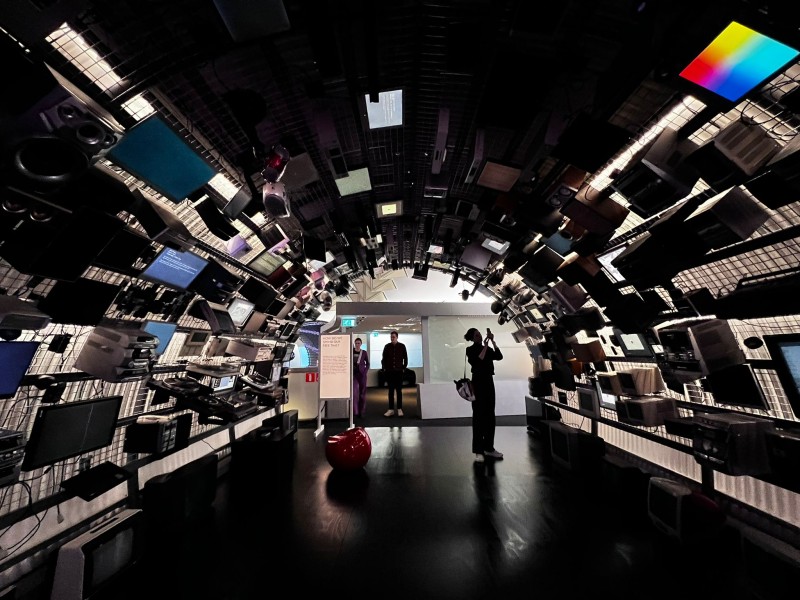
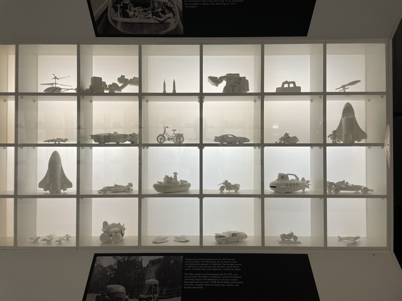
The future scenarios presented in the exhibition RETRO FUTURE showed many different ways of representation, such as interactions with different media, exhibits that represent a temporal evolution or in some way use technologies such as robots.
However, everything was presented from a retro perspective, as one imagined the future many years ago. I partly missed the modern vision of the future of today. How do we live with the increasing population, the ever decreasing space, the dwindling resources, with the many crises, such as wars or the environmental crisis? How can the whole already look in the near future? Through this space-are perspective, often the current circumstances and rapid further development of our society and technologies were not included. This has led to the fact that I have not felt particularly inspired, as we can shape our future in reality. I was more inspired by the different ways of exhibiting and the interactive experience.
- Lilli Seiler
»Life can only be unterstood backwards; but it must be lived forwards.«
The quote by the Danish philosopher Søren Kierkegaard displayed in the exhibition RETRO FUTURE has particularly stuck in my mind. His statement implies that if you want to change the present or future, you have to look back in the past, and learn from mistakes to try to do better, for a better future. Some of those visions, perspectives, ideas, dreams and expectations from the past are being introduced by the exhibition in Eindhoven.
For me as an art- and design studies student, the entire exhibition concept was very exciting and interesting to experience. Lots of different methods and resources were used to bring the topic closer to the visitor. Overall, the exhibition reminded me of a fairground, as most of the objects in RETRO FUTURE were interactive. For example, you could interact with an artificial intelligence, enter various rooms that transport you into a different time and world, or use VR goggles to observe both the past and the possible future. Even though the whole concept was quite entertaining for me, I would have liked to see more profound information in some parts of the exhibition. All in all, it was an interesting and engaging glance into past visions and ideas that can be compared to current designs to determine what has been realized or is still a complete utopia today.
- Alina Rogge
COFFEE + DIALOGUE with Steffen Siegel
It was a great pleasure today to have had Prof. Dr. Steffen Siegel as a guest for “Coffee + Dialogue” at the FUTURE DESIGN EMBASSY!
In preparation of our dialogue about “The relevance of the modernistic aesthetics in the photographic image …
It was a great pleasure today to have had Prof. Dr. Steffen Siegel as a guest for “Coffee + Dialogue” at the FUTURE DESIGN EMBASSY!
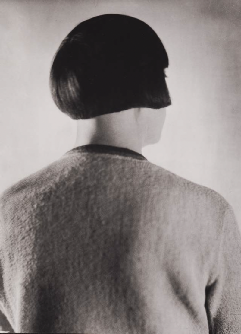
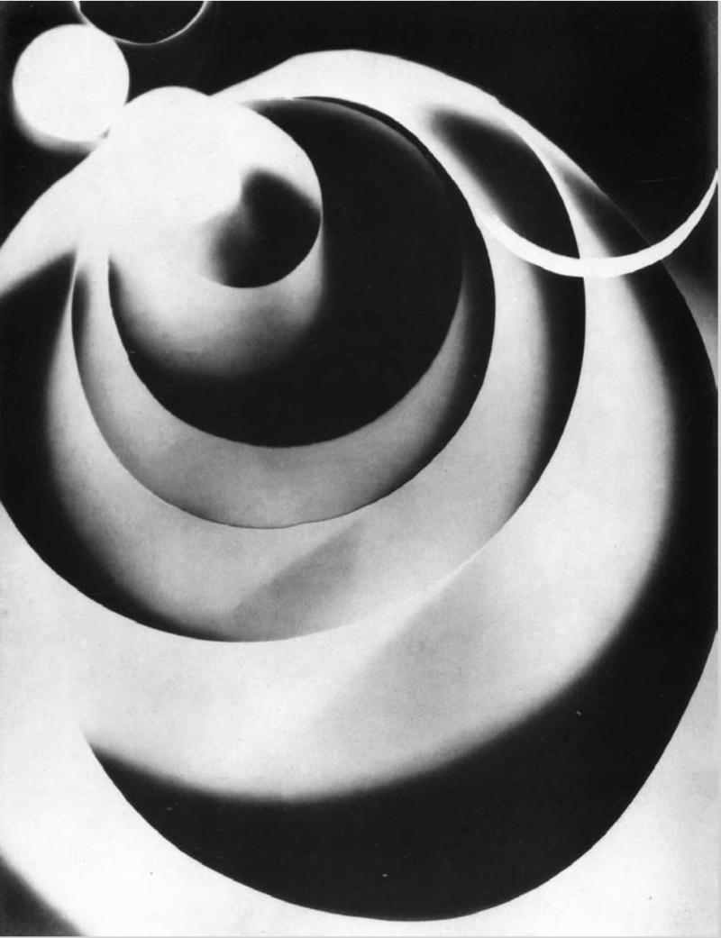
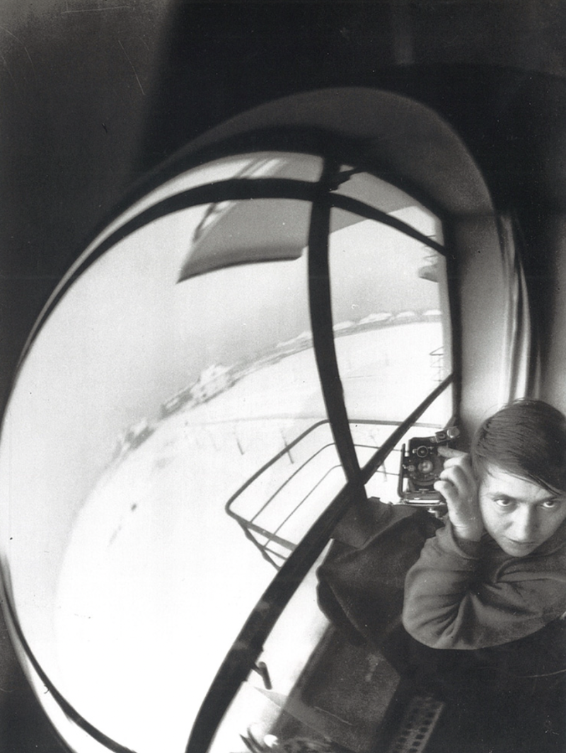
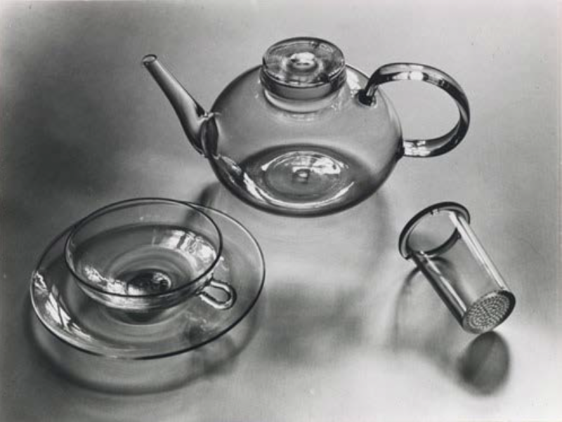
In preparation of our dialogue about “The relevance of the modernistic aesthetics in the photographic image of the 20th century towards social realities of the 21st century”, Steffen Siegel brought a series of images from the 20th and late 19th century as a base for discussion.
Steffen Siegel defined photography as part of the endeavor of Modernism, its characteristic aesthetics being most apparent in the time period from 1920-30.
With the portrait of Asta Nielsen by Yva from 1930 and the selfportrait by Cahun Claude from 1928, he showed examples of how Modernism brought upon new aesthetics and new topics, such as “The New Woman” in the beginning of the 20th century. The portraits reflecting the new gender fluidity in those times. A key concept of Modernism in photography was the presence of women.
The photograms by László Moholy-Nagy & Lucia Moholy (double self portrait, 1923) and by Man Ray (Rayograms 5, 1922), showed that renewed techniques and experimental practices were central in modernistic photography at the time. Artists and photographers wanted to brake with traditional and classic conventions and thus produced a new, more abstract vision, the so called “The New Vision”.
This new vision was characterized by aesthetic elements such as sharp angles or distortions as seen in the works of Alexander Rodtschenko (On the roof, 1932) and Marianne Brandt (self-portrait at the Bauhaus, 1929). Another key to Modernism in photography was how the photographic surface is rendered.
Modernism also entailed the search for objectivity, which is apparent in the works by Albert-Renger-Patzsch (The little tree, 1929) and August Sander. (High school student, 1928). They were practicing a new way to depict the world – New Objectivity. They aimed at a very specific way of establishing images by the means of the photographic body.
From today’s perspective the applied photography by Walter Peterhans was very artfull.
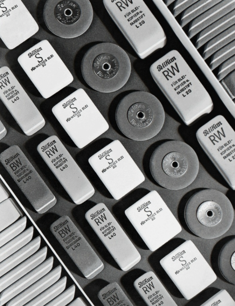
In his photograph of the glass-tea set by Wilhelm Wagenfeld in 1932, a new sense of sleekness and precision can be found, which perfectly matches the significance, which new technologies and minimalistic forms had in modern design at the time. A little later, in the mid-1930s Hein Gorny photographed erasers for PELIKAN, which he placed diagonally in a strict order in the layout of the photo.
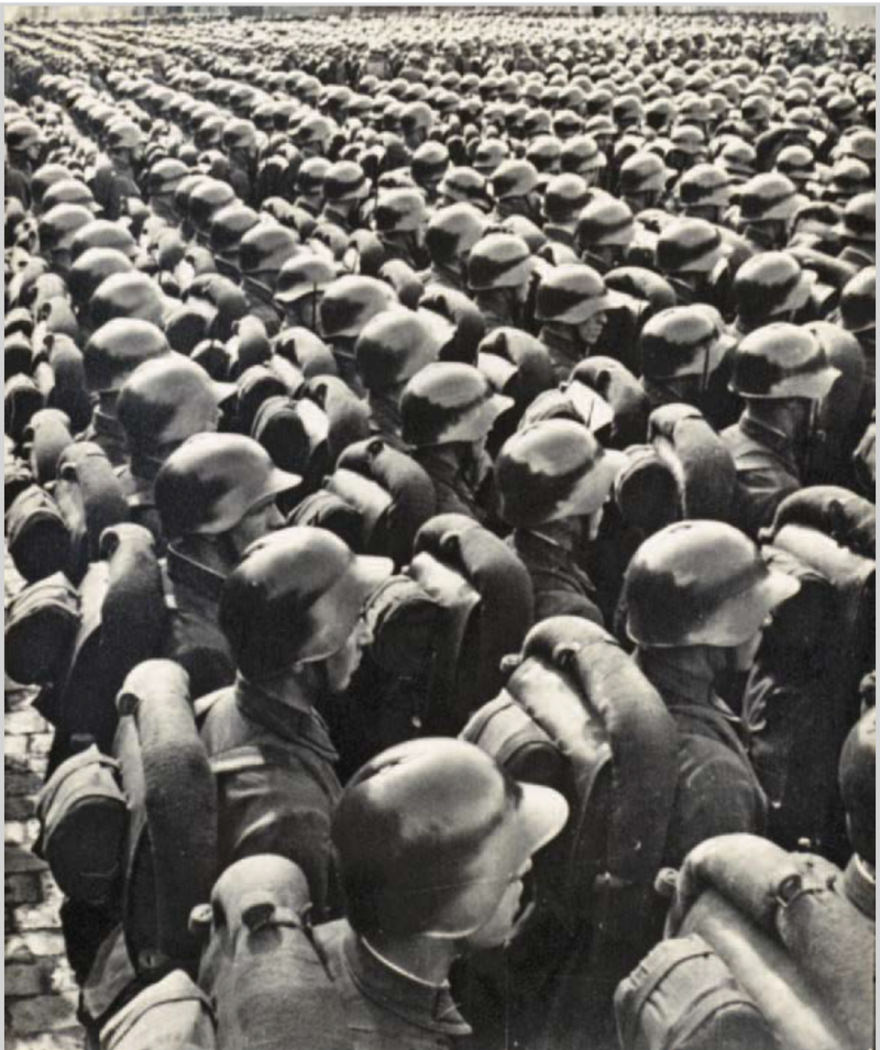
On the next page we see a very similar diagonal order in the photography by Georgij Petrussow in 1935, of soldiers standing in line, ready to go to war, used for the purpose of propaganda. This is something we cannot leave out when we talk about the aesthetics of Modernism. Another example for propaganda can be found in Willi Zielke’s photograph “Olympia” from 1936 in which he uses dramatic lighting and an upward view, as if looking at a statue, to produce a heroic vision of the young white male. Willi Zielke was the personal assistant of Leni Riefenstahl.
Modernistic photography also was subject to the question of its context, where does photography take place? With a photo depicting a news stand, Steffen Siegel makes clear, that modernistic photography was mainly distributed by the printed press and took place in printed forms as opposed to the medium of the internet, which coins our visual habits nowadays for the most part.
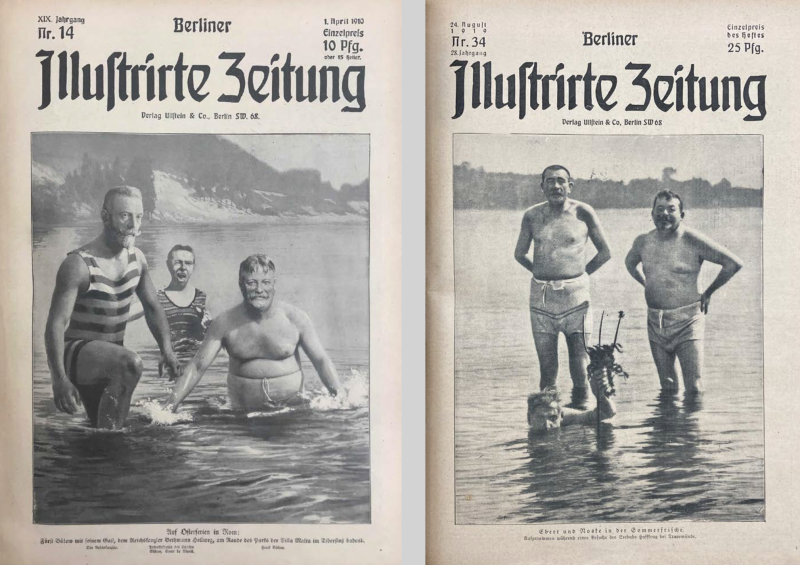
With a whole series of images from the “Berliner Illustrierte Zeitung, beginning in 1910, Steffen Siegel shows how modernistic public images were already challenging us on what to believe and what not much earlier. In the first issue of April every year, the “April fool’s issue” the BIZ showed images in which the visual information was doctored, a mockery to test the eye of the audience. It raised questions to what can we trust or not? There were images manipulated as photomontages in a way that they show politicians either on top of a pedestal or in their bathing suites, as needed.
So, photography had impact on politics and still has today. Already in its early history it cannot be trusted to depict the “real world” or the truth. Already then, visual Information could be mockery or fake. This leads to the question which is central in the 21st century – What kind of visual data are we dealing with and how can we trust media? How can we deal with media when it comes to our understanding of the world?
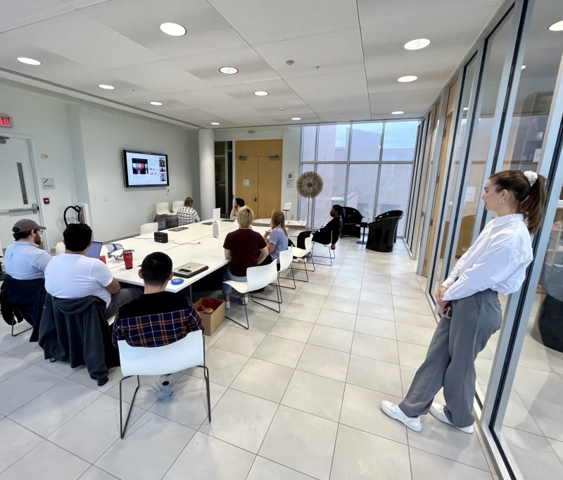
After Steffen Siegel’s presentation follows a lively discussion with the student ambassadors in presence at the embassy and the people online who consisted of our student ambassadors from RIT, as well as scholars from other Universities as far as Indonesia.
In the discussion there was astonishment about how early on “the Fake” was present in media. In our times, the multiple imagery surrounding us all the time raises the question of how to deal with those reflections of what could be the truth. The difference being that, in 1910 the audience was a passive receiver of images, spread by an institution like a publisher of whom one knew who it was, whereas today everyone can produce and spread images according to one’s beliefs or means. So, we not only have to question the image but also the reliability of its source.
Then follows a comparison of Modernism in Photography and with Modernism in Product- or Industrial Design. There seem to be many similarities such as the breaking with tradition, the sleek and slim aesthetics, minimalism, a normative quality, etc.
Steffen Siegel points out that there was a “see-change moment” when Product Design left the medium of Photography, instead using CGI (Computer Generated Imagery) or CAD (Computer Aided Design, how designers call it). He asks whether it matters if a product is rendered by a computer, in comparison to the photographic image of the real object. How do product designers deal with that? Is it welcome, because you can easily make changes and variations for example in colors etc.? Today you can render everything and the results are hardly distinguishable from photographs.
Product designers use CAD for visual models quite often and they are experienced in deciphering those images. However, when one uses CAD models in presentations, the audience takes them for real, which raises the expectation that the proposed product will be exactly like it, which practically never happens. So, for designers, visual models can’t replace the analogue models which are needed for experiencing and testing proposed design solutions. It turns out that there is still more trust in photography than in the CGI or CAD images when it comes to product representation. Yet, this remains an open discussion.
With the impact of a war in Europe again, after many years of believing we wouldn’t need them anymore, the discussion comes to tanks. Tanks are products that have been designed and engineered. Steffen Siegel points out that the old ones still are working while the new ones with their high technology and computer programming are not. So, the modernist belief in salvation through technology and digital solutions comes short in this case.
Back to the question whether Modernism will still be relevant in 20 years from now, the participants of the discussion make observations that minimalism is making a comeback.The student ambassadors from RIT are reporting how they are looking into the work of Lella and Massimo Vignelli as representatives of Modernism and how they apply those ideas to their own work.
“Less is more” and similar claims may sound very shallow today, but when it comes to the production of machines that we buy in millions, less material means saving a lot of resources. Thus, Minimalism seems to be helpful in terms of a more environment friendly product design, not only because less resources are needed, but also in terms of representing a form of “Green Aesthetics” conveying psychologically that the product is more sustainable. So, can the impact of modern aesthetics lead to a more equitable design?
On the other hand, the efforts towards more sustainable design also leads to new aesthetics – DIY and 3D-Printing bring upon more individuality and forms, quite contrary to Modernism. Sebastian quotes from a book by Marion Poschmann: Marion Poschmann, Laubwerk, Verbrecherverlag (2021) with critical short texts. She is asking for something totally different than the modernist point of view: According to her, the world should romanticize again: “If we want to conserve nature to prevent an ecological catastrophe, we have to re-romanticize the world in our perception of nature.” (translation from German)
As a wrap-up of the discussion, Steffen Siegel recommends a publication, a primer for Art History from 1915, by Heinrich Wölfflin “Kunsthistorische Grundbegriffe“. (Wölfflin, Heinrich; Kunstgeschichtliche Grundbegriffe: das Problem der Stilentwickelung in der neueren Kunst; München, 1915)* Here, Wölfflin offers a scheme, which one can’t escape in its logic. He suggests that historically there were always two strands of aesthetics driving each other: One, which is classic, slim, timeless, minimal, etc. and another one which is baroque, flamboyant, decorated and very much overdone. These come in repeating waves.This should be of interest for designers in the 21st century and also forms of their combinations.
*for the English publication see "Sources"
COFFEE + DIALOGUE with Cordula Meier
MODERNE
Was ist die Moderne aus der Sicht der Designwissenschaft?
Ohne diesen aufklärerischen Moment in der Moderne, vor allem durch die HfG Ulm (1953-1968), an dem gesagt wurde, es muss soziologisch gedacht werden – heute nenne ich das designtheoretisch – hätte es …
MODERNE
Was ist die Moderne aus der Sicht der Designwissenschaft?
Ohne diesen aufklärerischen Moment in der Moderne, vor allem durch die HfG Ulm (1953-1968), an dem gesagt wurde, es muss soziologisch gedacht werden – heute nenne ich das designtheoretisch – hätte es ohne die Moderne gar nicht gegeben.
Die Antwort aus der Sicht der Designwissenschaft heißt: Die Moderne ist ihre Grundnahrung.
Sind die Ideen oder Grundsätze der Moderne noch heute gültig und inwiefern sind sie für Designer*innen relevant, wenn sie sich den Herausforderungen des 21. Jahrhunderts stellen wollen?
Für die Designlehre bedeutet das die Vermittlung von Zusammenhängen. Ich muss den Studierenden nicht mehr erzählen, was das Bauhaus ist. Grundsätzlich steht ihnen fulminantes Wissen im Internet bereit. Wichtig sind diese Zusammenhänge: Wie baut was aufeinander auf? Wie sind Verknüpfungsmomente? Das ist ja eigentlich nur noch das, was man lehren sollte. Ich finde es wichtig, dass man die Moderne kapiert, dass man die Theorien und Ideologien dieser Zeit versteht. Wie kommen die Modernist:innen dann zu einer Kaffeetasse oder zu einem Stuhl? Wie ist der Zusammenhang? Aber sicherlich kann man die Moderne heute nicht eins zu eins brauchen, sondern das muss irgendwie anders gehen.
Ich glaube aber, dass so eine Designgeschichte – und davon bin ich wirklich felsenfest überzeugt – die beste Kreativitätstechnik ist. Wenn man Phänomene aus der Designgeschichte kennt und sich aneignet, können aus verschiedenen Denktraditionen heraus Entwürfe entstehen: im aufklärerischen Sinne, im Sinne Focaults oder auch im Sinne der Postmoderne wie Memphis. Die Moderne als Kreativitätstechnik bietet einen Einstieg in den Entwurfsprozess.
Davon ausgehend, dass modernes Design Kriterien wie Angemessenheit, Minimalismus, Zeitlosigkeit, Funktionalität und den demokratischen Gedanken, dass Produkte für möglichst viele Menschen erschwinglich sein sollten, beinhaltet, sind diese Maßstäbe für das Design noch heute hilfreich?
Ich glaube, dass die Kriterien der Moderne als Ideologien und Theorien noch ganz hervorragend angewendet werden können. Das gilt allerdings nicht für die Ästhetik der Moderne wie sie sich damals gezeigt hat. Um eine Ästhetik im Sinne von Dampferarchitektur oder dem rechten Winkel Ulms, darum kann es heute gar nicht mehr gehen. Leute, die aufklärerisch denken, sagen, die Moderne ist heute zum Kitsch verkommen. Man guckt sich die Reihenhäuser an, die heute gebaut werden, die die Idee haben als seien sie Moderne Strukturen, aber in Wirklichkeit sind sie nur eckig und im rechten Winkel. Das ist eine Art verkommener Modernismus, der gar nicht mehr zu gebrauchen ist.
Im Rahmen dieser Projekt mit dem Vignelli Center for Design Studies sind wir bei den Vignellis, die deutliche Vertreter:innen der Moderne sind, immer wieder auf den Begriff der Timelessness gestoßen, der auch mit Formensprache zu tun hat, aber heute vielleicht anders interpretiert werden muss. Wie sehen Sie diesen Begriff als Designhistorikerin? Gibt es sowas überhaupt?
Diejenigen, die bei mir studieren, wissen ja, dass das Wort zeitlos bei mir verboten ist. Zeitlos ist verboten, denn es gibt kein Ding außerhalb der Zeit. Jedes Ding ist in seiner Zeit, jetzt in dem Moment, genauso wie jeder Mensch nur in seiner/ihrer Zeit ist und auch genauso sozialisiert worden ist. So ist auch diese Kaffeetasse zu ihrer Zeit – vor 10 Jahren oder in 20 Jahren hätte sie nicht so aussehen können.
Was viele mit Zeitlosigkeit meinen, ist, dass es über einen großen Zeitraum akzeptiert wird, beständig ist oder produziert wird. Also nicht kurzlebig, sondern langlebig. Also Zeitlosigkeit, ist vom Wortbegriff her falsch, denn die gibt es so nicht.
Objekte können zwar sehr langlebig sein, sind aber trotzdem immer nur in ihrer Zeit richtig, denn wenn sich die Energiesituation oder technische Errungenschaften entwickeln, verändern sich auch Objekte.
Die sogenannte Zeitlosigkeit in der Moderne oder die moderne Gestaltung bei Rams war ja immer verbunden mit etwas, das heute vielleicht als elegant interpretiert werden kann, aber damals nicht das vorrangige Ziel war. So sind diese formalistischen Ziele der Moderne nicht mehr notwendig, aber der Prozess zum Produkt, der Entwurfsprozess, der kann in einer ähnlichen Art und Weise sehr sinnvoll sein.
NACHHALTIGKEIT
Angesichts der Probleme des Klimawandels, des Bevölkerungswachstums, der schwindenden Ressourcen, der Zerstörung der natürlichen Lebensräume vieler Arten, ja sogar der Zerstörung unseres eigenen Lebensraums auf der Erde, stehen verantwortungsbewusste Designer*innen vor der Herausforderung, nachhaltige Lösungen für die Gegenwart und die Zukunft zu finden. Können die oben erwähnten Kriterien für modernes Design dabei ein hilfreicher Leitfaden sein?
Ich hab mich hier vielmehr gefragt, wie Designer:innen die richtigen Entscheidungen treffen können. Da sehe ich ein Riesenproblem. Welcher Ideologie, bezogen auf neue technische Visionen, glaubt man? Da die richtige Entscheidung zu treffen, ist schwerer denn je. Und das kann ein:e Designer:in nicht entscheiden, zumindest nicht alleine. Das Schöne an diesem Beruf ist, dass man sich von sehr vielen Fachleuten – und so würde das auch ein:e Modernist:in machen – Informationen einholt, um zu einer Erkenntnis im Entwurfsprozess zu kommen.
Wenn verschiedene Perspektiven eingenommen werden, kann eine aufklärerische Idee entstehen und sich daraus wiederum eine Form entwickeln.
ÄSTHETIK
Was bedeutet Ästhetik für Sie?
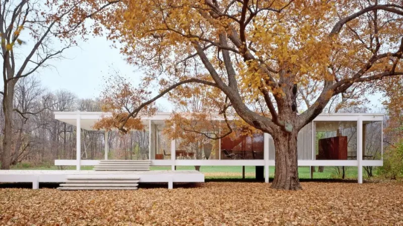
Ich begreife meine Seminare immer auch als ästhetische Erziehung. Um die Moderne zu verstehen, zeige ich sehr gerne Häuser, an denen die moderne Ästhetik abgelesen werden kann. Beispielsweise an Mies van der Rohes Farnsworth House (Illinois, 1945-1951).
Am Ende Frage ich dann: Wenn Sie sich ein Haus wünschen dürften, welches würden Sie nehmen?
Meine größte Enttäuschung ist immer, wenn sie Farnsworth House verneinen und sagen, es hat zu große Fenster, da kann ja jeder reingucken oder die freien Flächen seien kalt. Das ist für mich so ein Versagen, dass ich es nach zwei Stunden reden nicht geschafft habe, die wahnsinnige intellektuelle Größe dieses Hauses zu erklären, weil es durch seine Reduzierung auf das Wesentliche zu freiem Denken führt, dass dort zu sich und zum Eigentlichen gefunden werden kann.
Ich glaube, wir haben die Moderne, verknüpft mit freiem Denken, freiem Leben und mit dieser Ästhetik den Studierenden noch nicht erklären können.
Vor ein paar Jahren haben Sie in den Designwissenschaften ein Symposium organisiert, mit der Frage “Was denn das Schöne sei?” Inwiefern ist diese Frage angesichts der Herausforderungen des 21sten Jahrhunderts noch relevant für Designer*innen? Hat die Moderne in dieser Frage ihre Bedeutung angesichts der Herausforderungen des 21sten Jahrhunderts verloren?
Cordula Meier: Designer:innen müssen erklären können, warum was gut ist – und das nicht nur anhand funktionaler Eigenschaften. Die Ästhetik muss auch erklärt werden, aber wo liegen heute dafür die Merkmale? Die Moderne hat so einfache Kriterien geliefert in der Beziehung. Und jetzt sind die irgendwie zum Teil ad absurdum geführt, würde ich sagen. Wobei die Postmoderne, zu Beginn zumindest, genauso leichte Kriterien hatte: Es soll Spaß machen, es soll viel zitiert sein, die Lüge, die Ironie, alles soll integriert sein. Diese Kriterien sind ähnlich leicht umzusetzen, aber ich glaube, dass Ergebnisse im Design zur Zeit, gerade in dieser Zeit, diese wenig erfüllen.
Ich glaube schon, dass die modernen Herangehensweisen, wo sich aus der Ideologie heraus etwas darstellt, auch heute noch die richtige Wahl sind.
Marion Digel: Trotzdem hat die Postmoderne wichtige Einstellungen mitgebracht, wie z.B. „Es darf Spaß machen!“. Dass wir irgendwas gestalten, das einfach nur dafür da ist, Spaß zu machen, ist etwas, dass wir uns heute nach der Zeitenwende noch weniger trauen. Dabei ist dieser Aspekt der Postmoderne so wertvoll.
Cordula Meier: Natürlich, man möchte sie auf keinen Fall missen! Auch nicht als Reaktion auf diesen starren grauen rechteckigen Winkel Ulms.
In den letzten Jahren haben Konzepte wie DIY, BIOdesign und zirkuläres Design zusammen mit digitalen Produktionsmethoden wie 3D-Druck zu sehr diversen Formen von Ästhetik geführt. Ist in diesem Zusammenhang der Ästhetik-Begriff der Moderne noch hilfreich, um die Frage zu beantworten, was gutes Design sei? Und ist die Frage, was eine "elegante" Designlösung ausmacht, überhaupt noch von Interesse?
Schaut euch die ganzen Produkte von Apple an! Sie kommen in einer solchen reduzierten Ästhetik daher – von der Optik wirklich wie die alte Moderne. Obwohl ein biscchen pseudo elegant, aber immer noch sehr akzeptiert.
Welche Bedeutung hat die Ästhetik der Moderne für junge Designer*innen in der digitalen oder postindustriellen Gesellschaft?
Was ich mir als Stichwort dazu überlegt habe, ist die Autorenschaft. In der Moderne war es eigentlich so – obwohl Dieter Rams das bei Braun ganz anders gemachthat – dass die Designer:innen hinter diesem Funktionalem, Faktischen, hinter der jeweiligen Firma verschwinden. Es sollte das Hotelzimmer, das Automobil, den Stuhl geben und fertig. Und trotzdem war immer wieder ein Bedürfnis da, eine Autorenschaft, eine Signatur zu setzen. Ein Aspekt, der auch aktuelles Design betrifft, weil auf das Gestaltete anders geblickt wird. Ein gutes Beispiel dafür ist der Roman mit anonymer Autor:in. Eine Autor:innenlosigkeit, wie es in der Moderne gefordert, würde heißen, man liest den Roman und es steht nicht drauf: Rosamunde Pilcher. Wenn das nicht draufsteht, dann liest man den Text so anders, dann wartet man nicht auf den Mörder oder ein schlimmes Ereignis. Nein, aber wenn Rosamunde Pilcher draufsteht, weiß man die heiraten hinterher.
Die Rezeption ist eine so andere, wenn Dieter Rams drauf steht oder nicht. Die Autor:innenschaft finde ich eine wichtige Frage, auf die uns die Moderne keine Antwort gegeben hat.
COFFEE + DIALOGUE with Martin Middelhauve
It was a great pleasure to have Martin Middelhauve as a guest for our second Coffee + Dialogue session with the topic CULTURAL EXCHANGE.
Middelhauve who is a Professor for Object- and Roomdesign at the German FH Dortmund tells us, that …
It was a great pleasure to have Martin Middelhauve as a guest for our second Coffee + Dialogue session with the topic CULTURAL EXCHANGE.
Middelhauve who is a Professor for Object- and Roomdesign at the German FH Dortmund tells us, that as a teacher, he is pretty humble to explain the world and how to do stuff. “For me it’s more about asking questions and offering some tools to express the things the students are working on,” he lets us know.
As a designer and teacher he has a long history being part of IDEM, the International Design Experimental Meeting, a workshop based conference living international- and cultural exchange within the design disciplines since the early 90s.
Within his international experience, he was always more impressed from similarities than from differences, he tells us. “Design is an international language,” Martin Middelhauve states. He describes his experience of working on projects with other designers who couldn’t be more different to his own cultural background but when it came to the moment of designing together, within minutes there was a common base and a precise understanding of each other.
“If we talk about scenography and exhibition design, which always means to code and decode visual aspects of space, there are other expectations between different cultures, even if they seem pretty close at first,” Middelhauve explains. “Being sensitive and open to diversity is mandatory, always and especially within an international context.”
Martin Middelhauve is convinced that if you dare to laugh about yourself and the others – together, you have reached a point, which functions as a good base for creative work within an intercultural exchange.
Within our discussion on a whether the ideas of modernism are still being sufficient enough (or not) to potentially solve the problems of the 21st Century, Middelhauve believes that: “We are kind of stuck not just in our commercial- and product world. We are in a democracy-crisis, have to deal with climate change. Big things, that could perhaps evoke a kind of movement. We probably have to change really from the ground and not just continue to make the same products a little bit more sustainable, or buy organic milk, or drive electric cars,” the designer and teacher speculates.
Martin Middelhauve thinks that if you are a design teacher, you have really question what we are doing. One of the first questions he asks his students when they start their studies is: “What do you think, why I am paid for sitting here with you? Who's paying me and why? And this is a first step in questioning what is designed and what are we doing here and what is the function of all of that?,” he explains.
“Together with my students I like to doubt my own role as a design teacher, teaching them – to teach that you have to question your own role in design and in your function as a designer. And this is so multilayered, that you realize, there are no easy answers to nothing. The only thing that helps is to be really critical about it.” Martin Middelhauve points out.
Workshop 01 "Light and Liminality" Day 5
It is hard to believe, but today is already the last day for us at RIT and the last day of the workshop. We headed to campus with mixed feelings. On the one hand, we are very excited about the …
It is hard to believe, but today is already the last day for us at RIT and the last day of the workshop. We headed to campus with mixed feelings. On the one hand, we are very excited about the students' results so far and to what extent our input has been able to help them with their projects in the end. On the other hand, it is really sad that today is the last day for us at RIT and that we will not be on site for the rest of the progress of the students' projects. Very bittersweet.
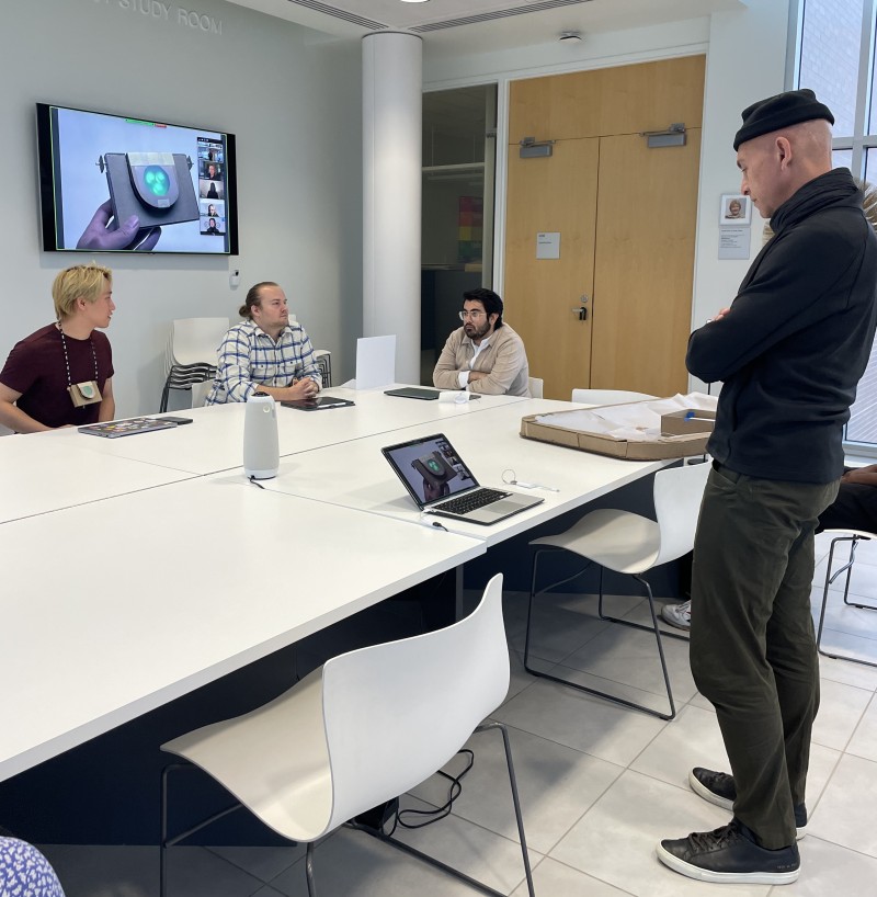
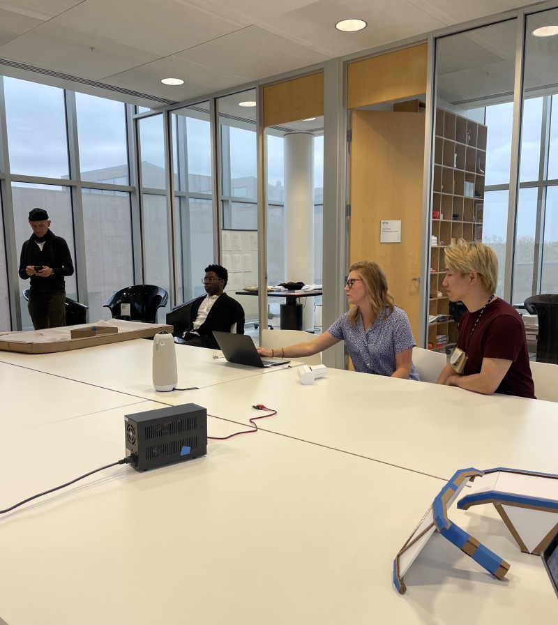
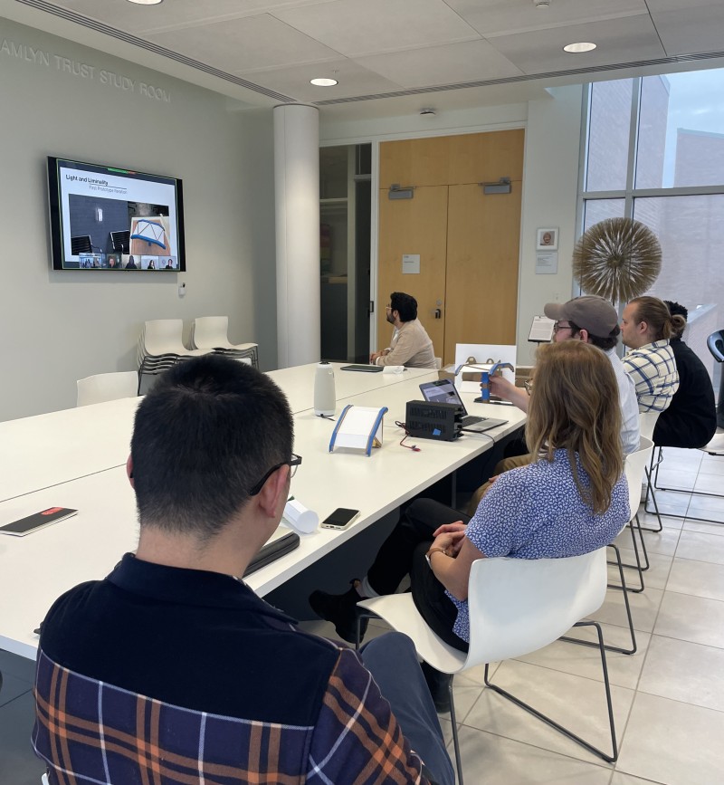
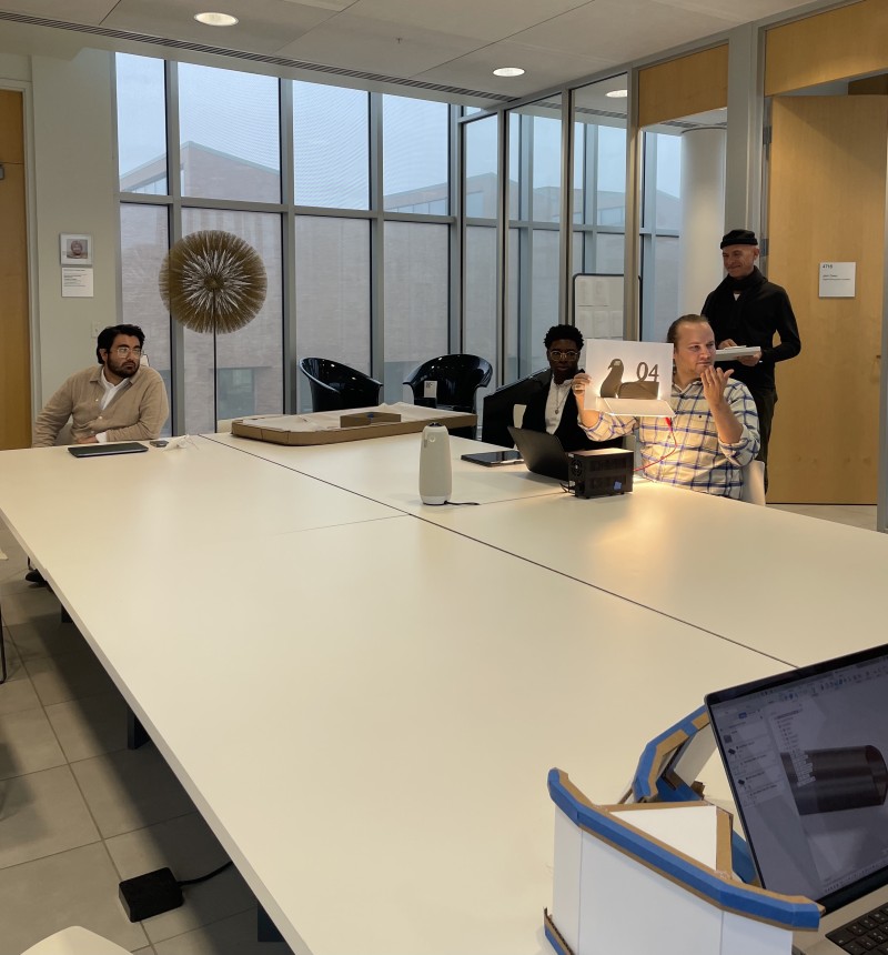
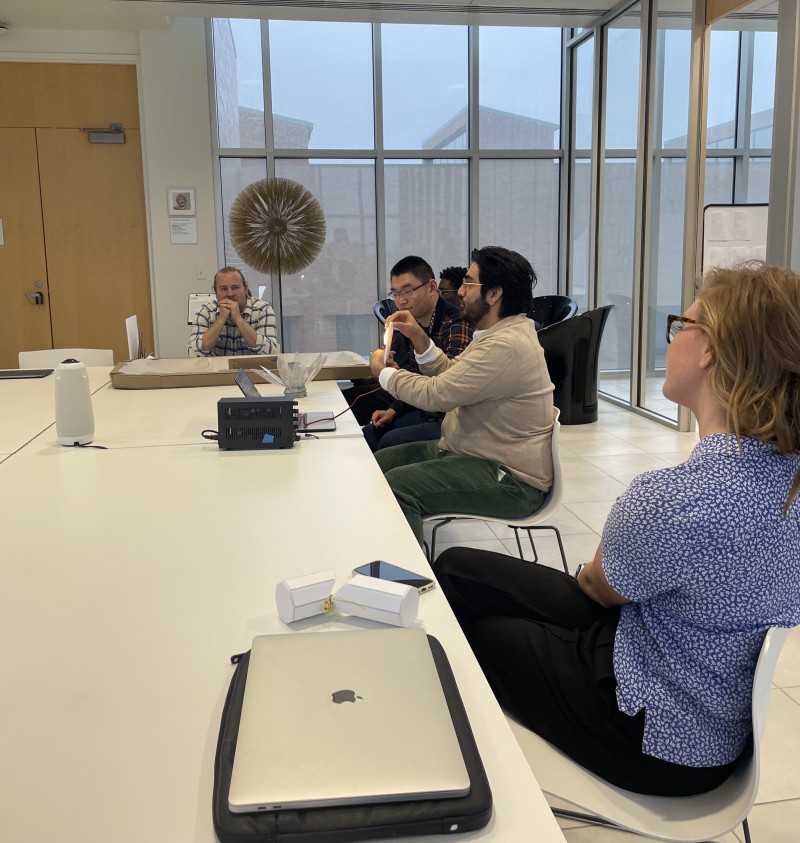
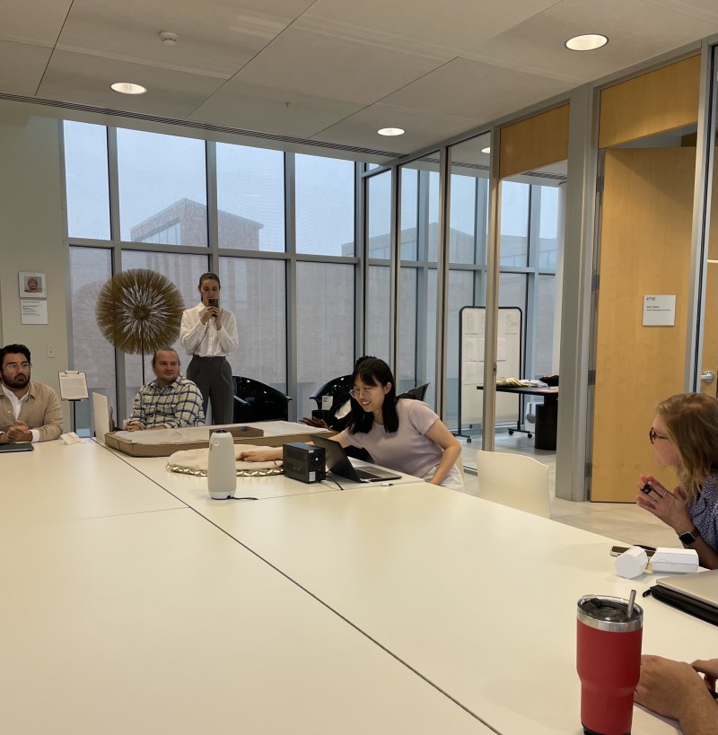
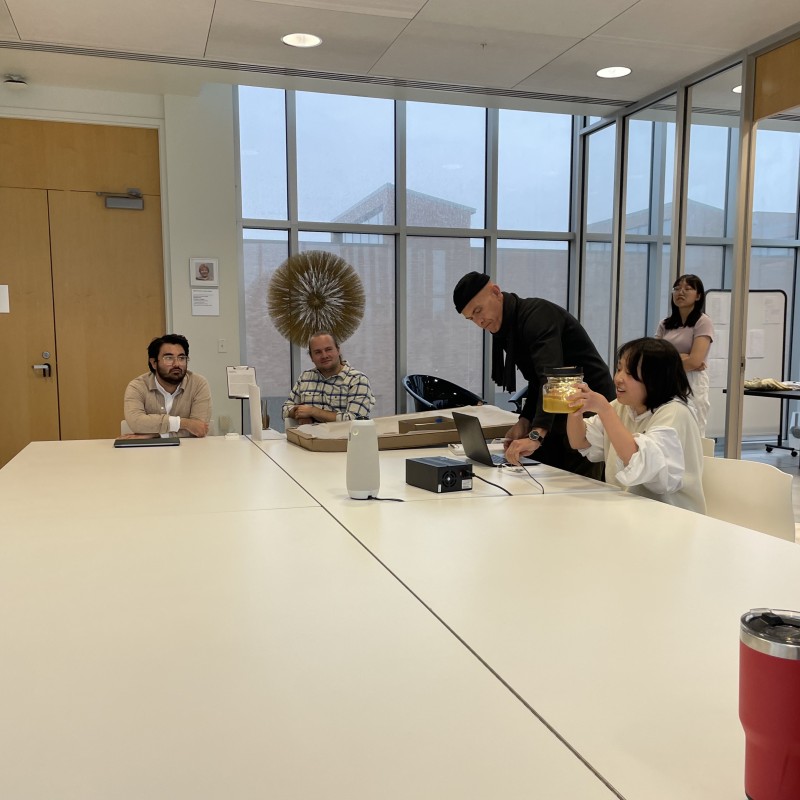
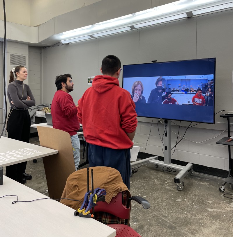
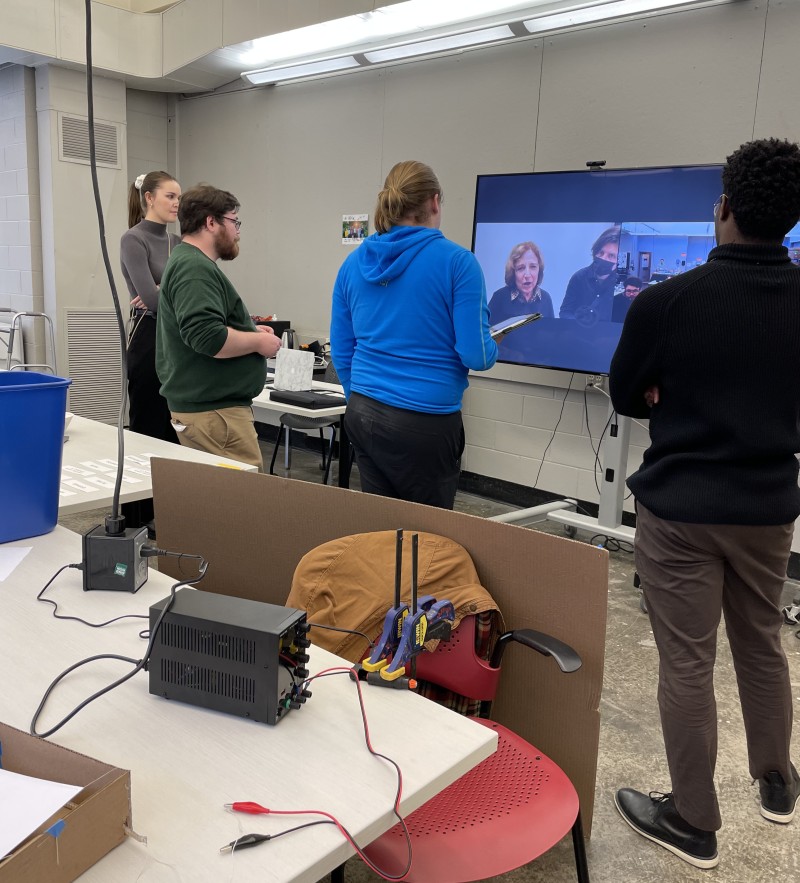
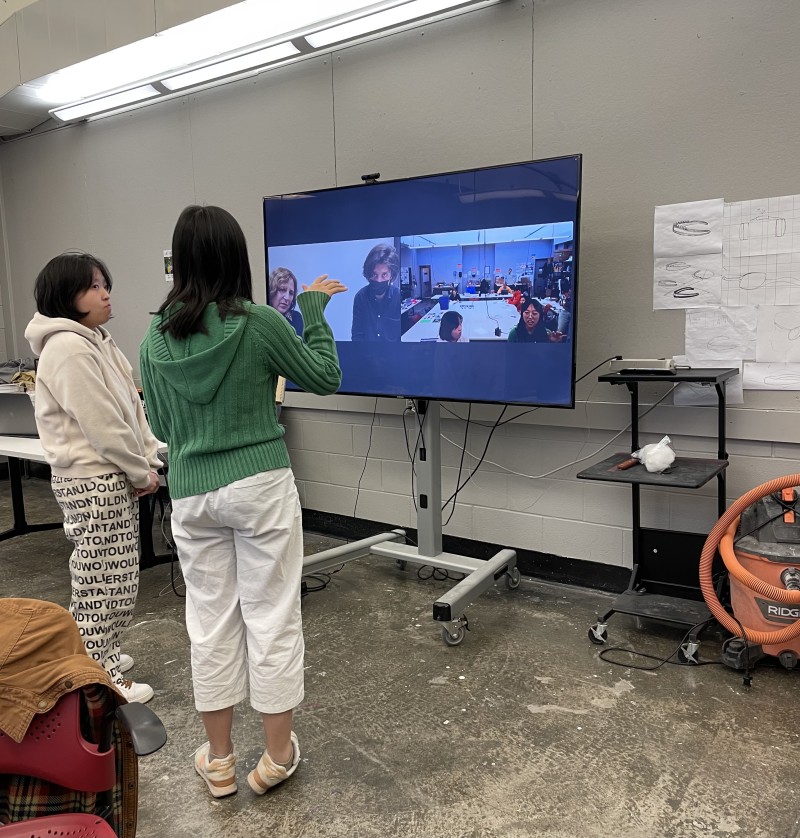
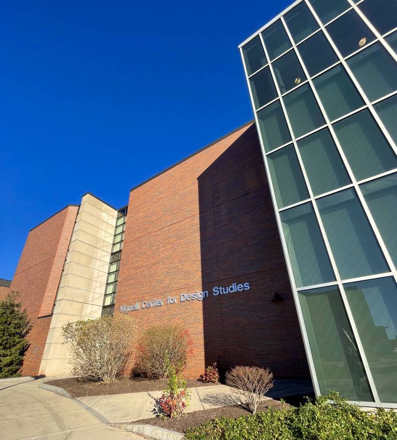
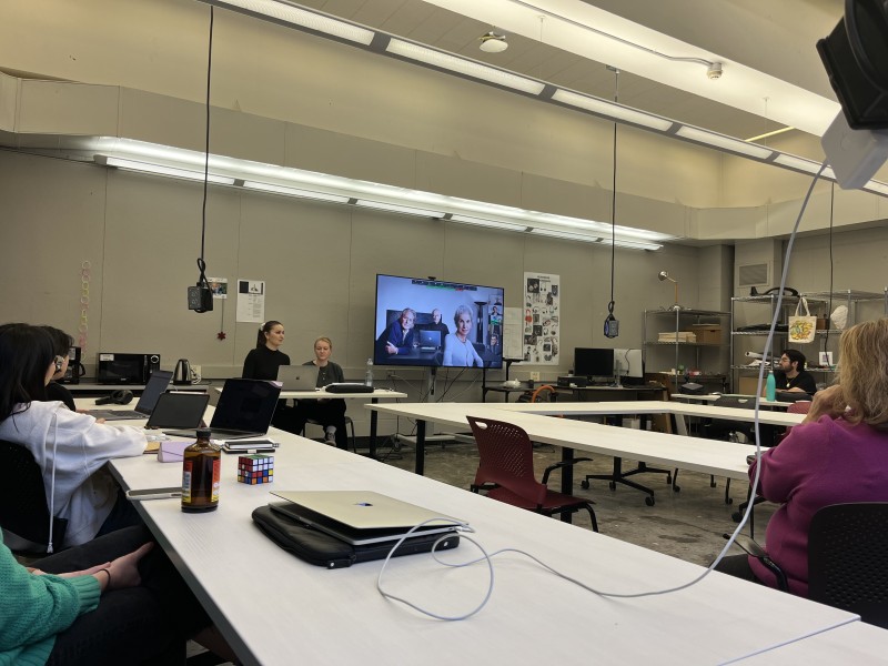
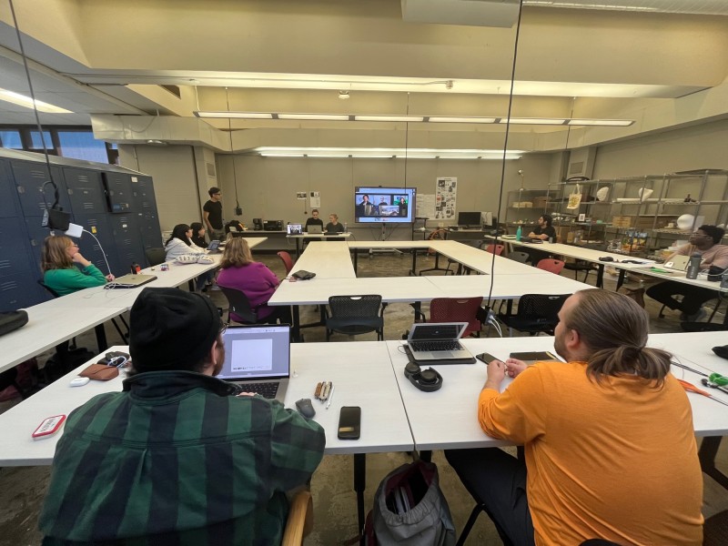
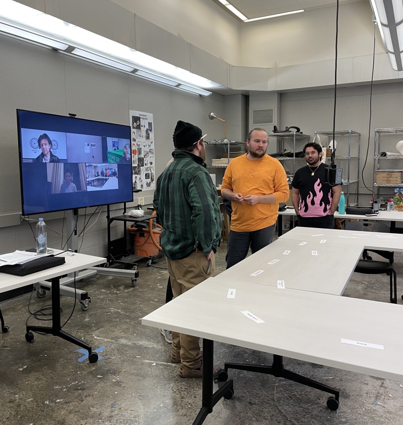
The meeting took place at the large table at the Vignelli Center for Design Studies. Josh Owen, Juan Noguera and Alex Lobos were also on site. Via zoom, Lorraine Justice and again our German team joined in. When everything was set up, the first team consisting of Ariella Knight and Jayden Zhou started to present. They focus on the liminality "transition from pain into no pain". Both intend to use green light to fight migraines. Ariella experimented a bit more with different sizes for her Vignelli inspired lamp and chose a slightly smaller version than before. She also envisions incorporating different types of filters and green spectrums. Jayden drew on playful inspirations from Ingo Maurer for his portable migraine lamp. He presented a very well-developed prototype. His lamp can be hung around the neck by the user through a chain, allowing easy transportation. In his next steps he wants to think about the material and refine the shape.
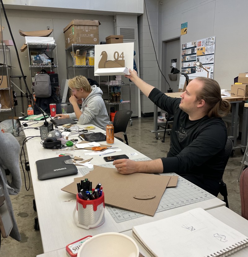
Next up was the three-person team, which focused on the "train station" theme. Robert Deane presented first. His lighting design was inspired by the architecture of historic train stations and is intended to show a mixture between old and modern stations. The lamp should communicate to pedestrians when a train is arriving. For Robert it is important that his light is diffused by using specific fabric, yet at the same time it should remain very bright. Jos Mayo was next. He presented a lamp in the shape of a pigeon. The lamp should illuminate and draw attention to the environment. He found inspiration in sketches and lamps by Maurer. As a next step, Jos would like to add either the platform number or the number of the train to his light. Tayo Oke followed as the last one of the team. His object is not a traditional lamp, but rather a mood board. This mood board is designed to transform the waiting room into a spectacle and allow people to more easily connect with others while waiting. For the frame of the screen, Tayo envisions either an aluminum or a steel one.
Shen Liu and Zaheer Shujayee, who dealt with the liminality "way home," presented next. Shen's lamp, in the shape of a flower, can detect the direction in which the pedestrian is walking. As a result, the petals open and the lamp begins to illuminate. After some time, the light goes off and the petals close again to save energy. The lamp is to be placed in public. For this purpose, in further steps, it will be important for Shen to consider how the lamp will be fixed into the ground. Zaheer's light is designed to make the user's way home safer, providing an extremely bright light. By using a particular fabric, a more diffused light is also provided in addition to the bright light. The round light can be attached to the back of the cell phone and also offers the possibility of placing it in a horizontal position.
The liminality "getting out of bed" by Jacqueline Qiu and Anqi Zhu was the last to be presented in front of the class. Jacqueline wants her light to increase the user's motivation to get up in the morning. She chose a carpet whose rim lights up when it is time to wake up. The clear and simple design is inspired by the Vignellis. For Anqi, besides the aspect of helping people to wake up, it is important to her that her light also uses as little energy as possible. Her Maurer-inspired light is in a glass ball that is half filled with water and half filled with sand. Through a transparent tunnel, a light ball moves when it is time to wake up.
After the last presentation, we took the floor again. There was nothing left for us to do but to express our sincerest gratitude to all the participants for their warm welcome, their commitment and their enjoyment of the workshop. Of course, a big thank you also goes out to the American and German professors and lectures for their continuous support and assistance during the whole process of the workshop. All in all was a real pleasure for us and an unbelievable journey. A once in a lifetime opportunity which we are extremely grateful for.
Workshop 01 "Light and Liminality" Day 4
After a small breakfast, we returned to the campus. We began the workshop with brief presentations from the students today to get updates on everyone's progress, provide feedback, and answer questions. Afterwards, in preparation for tomorrow's intermediate presentation, students were …
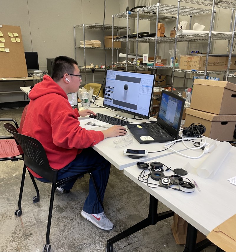
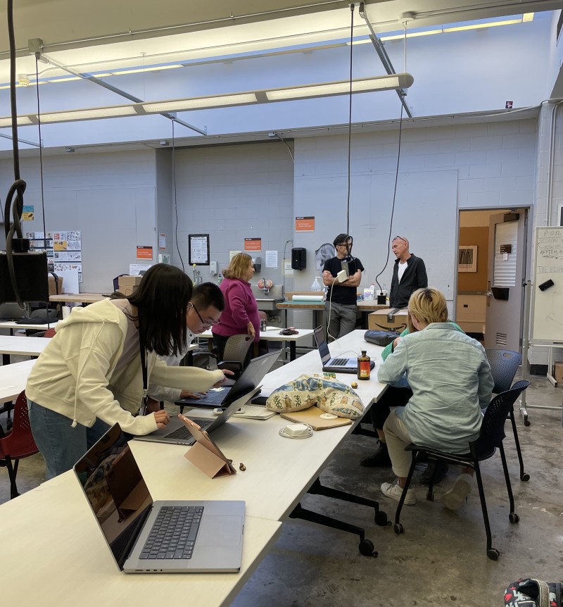
After a small breakfast, we returned to the campus. We began the workshop with brief presentations from the students today to get updates on everyone's progress, provide feedback, and answer questions. Afterwards, in preparation for tomorrow's intermediate presentation, students were given a brief but informative presentation on making prototypes, mock-ups, and visualizations. The rest of the day the students were to continue preparing their CAD visualizations and mock-ups and further finalize their concepts. They should always have the presentation tomorrow in mind to ensure that their concepts and ideas are presented in the best possible way. Since the short presentations yesterday already went great and the students are making great progress, especially in such a limited time, we are already very excited about tomorrow and the results so far.
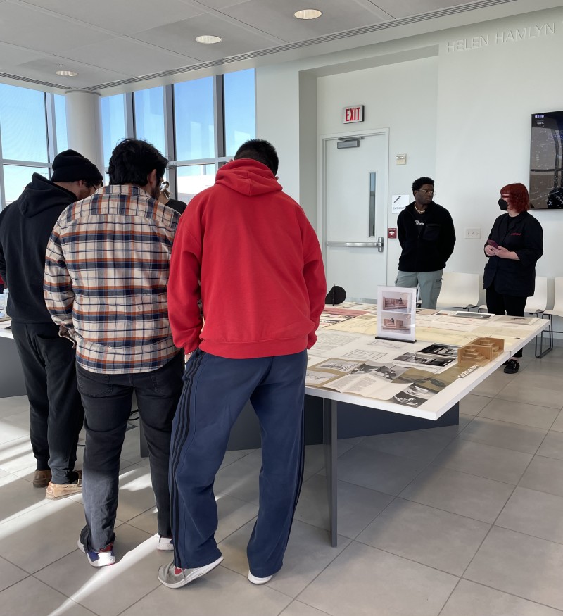
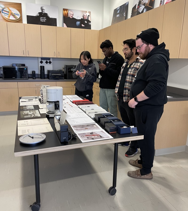
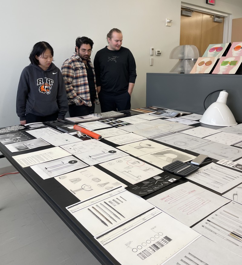
We told the class about our visit to the Vignelli Center for Design Studies and the Open House. With everyone who expressed interest and wanted to get additional inspiration we headed to the Archive. After some time, once the students and we had taken a look at all the exhibits on display and also had the chance to talk to Jennifer Whitlock and Josh Owen, we went back to the classroom. Back in the classroom, any final questions from the students were addressed.
Later that afternoon, we headed towards home to see some more of the city of Rochester and to visit Pittsford Farms Dairy to try the ice cream that was recommended to us by many. Two ice cream scoops later, we totally get the hype of the store :)
Workshop 01 "Light and Liminality" Day 3
In today's session, as on the first day of the workshop, Marion Digel and Sebastian Goldschmidtböing joined via zoom. Each group presented its process on the projects so far. The first group to present their projects were Ariella Knight and …
In today's session, as on the first day of the workshop, Marion Digel and Sebastian Goldschmidtböing joined via zoom. Each group presented its process on the projects so far. The first group to present their projects were Ariella Knight and Jayden Zhou. They chose the liminality "transition from pain into no pain". In doing so, both want to focus particularly on the pain of migraine and how to ease that pain. Thereby Ariella pursues the design approach of the Vignellis. Jayden's design is more inspired by Maurer's design aesthetic. Both want to use green light in their projects, which supposedly relieves migraine pain. In addition, both students want their light to be transportable, meaning that it is available to the user when it is needed. Jayden plans to have his light hung on a necklace. Ariella is thinking about making a bottle-sized light so it is also portable.
Then followed the team which focused on the "way home". Shen Liu has chosen Maurer's design approach. He plans to design a lamp for public spaces that resembles the shape of a flower. The lamp will be powered by solar cells. When someone walks past the flowers, the petals shall open and the light turns on. In his project Zaheer Shujayee follows the design approach of the Vignellis. Inspired by his own experiences, Zaheer wants to design a small, portable device that attaches to the phone and provides the user with a very bright light to make the “way home” more secure.
Next, the team of three, Tayo Oke, Robert Deane and Jos Mayo were asked to present how they want to approach their projects that all deal with the topic “train station”. Jos has chosen to follow Maurer's more playful design approach. At the same time, he was inspired by the Vignellis because he likes their practical approach to assist people to get to the right platform and on the right train. Jos outlined that he wants to design a lamp with a number and a specific color. Each train receives the matching number and color. The lamp with the corresponding number will light up when the train arrives. The lamp should ensure that passengers have a better orientation on the platform.
Then Robert followed with his project, which is more in line with the design aesthetic pursued by the Vignellis. Robert wants to design a lamp for the train station that flashes when the train arrives at the station. He wants the light to be bright but also warm and diffused. The aesthetics of his lamp are intended to bridge the gap between American and British train stations. The next in line was Tayo, he went to a train station and observed to gather more input for his project. Tayo draws aesthetic inspiration from Maurer and Lella Vignelli, but also from the American artist James Turrell. He is thinking about designing a light that covers a large section of the wall and that will encourage people to approach others on the platform and start conversations. The more central the individuals are to the light, the brighter it is and the more open the person is to engage in conversation.
Jacqueline Qiu and Anqi Zhu address the issue of “getting out of bed”. Jacqueline has chosen the Vignelli way, Anqi’s project explores Maurer's design aesthetic. Anqi is thinking about designing a lamp that helps the users to wake up and get up in the morning more easily and smoothly. Therefore, her idea is to fill a container partly with sand and partly with water. A luminous light ball moves through a transparent tunnel when it is time to wake up. Encouraging people to get up in the morning is the goal of Jacqueline’s project. A carpet that lies under or next to the bed that lights up when it is time to get up is her first approach. A second scenario that Jaqueline has thought about is to design a carpet that can light up in different colors and illuminate the whole room when you stand on it after waking up.
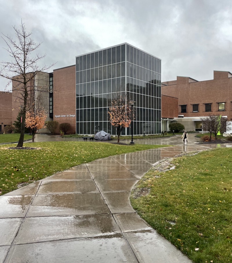
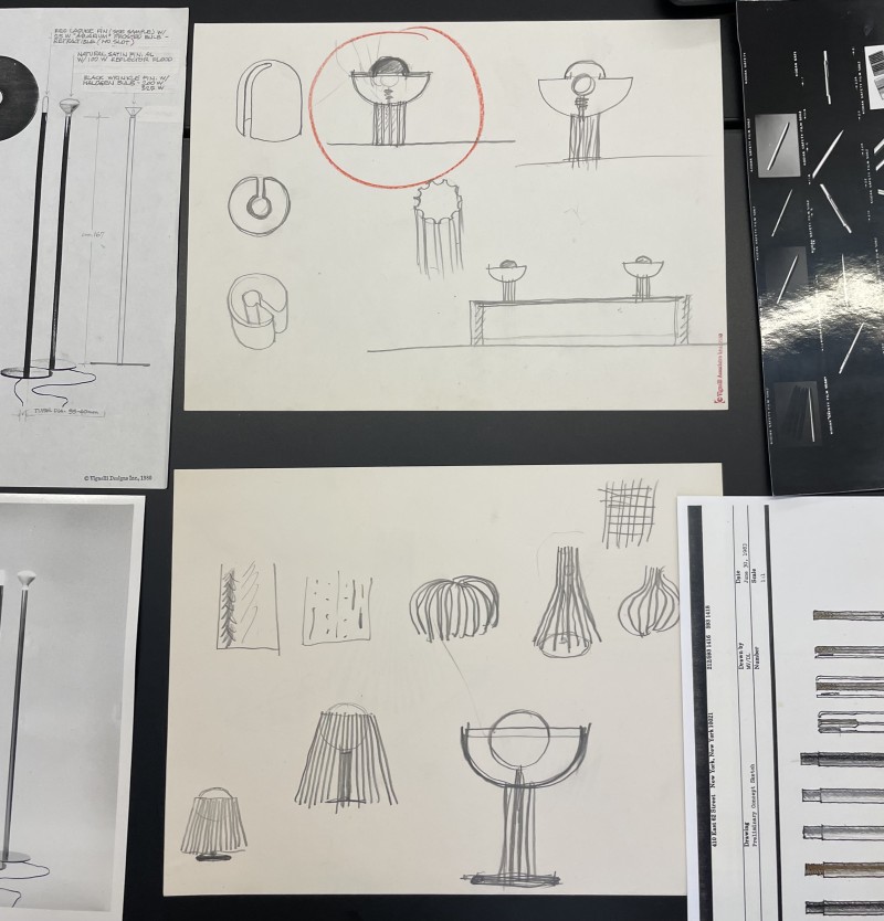
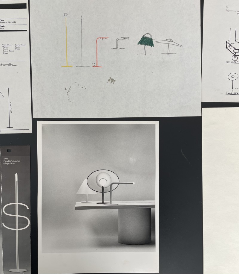
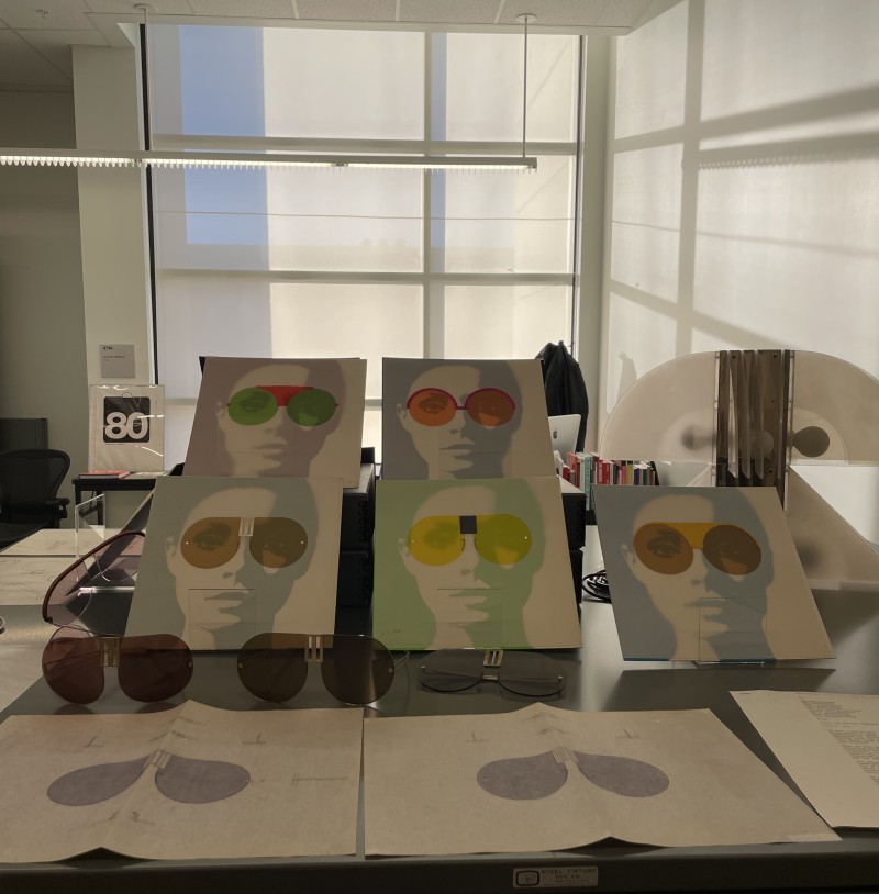
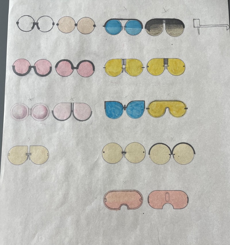
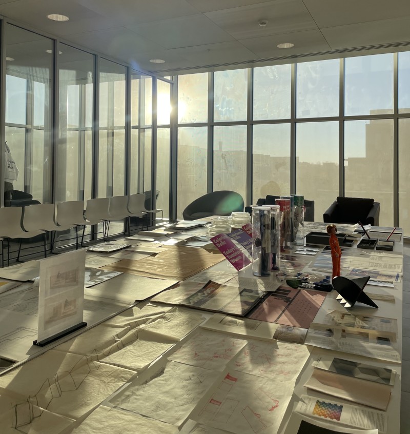
After a short lunch break, the two of us went to the Vignelli Center for Design Studies. This is where the Open House took place. The event takes place about three times a semester and lasts two to three days. What makes the Open House so unique is that anyone, whether RIT students, staff or the Rochester community, can visit and study the galleries and archives. Archivist Jennifer Whitlock selects special artifacts from the archives for the exhibit that are usually not available to the public. She and Josh Owen were on site to answer questions from visitors. Talking to Jennifer about the archives and her work as an archivist was very memorable and special for us. Many unique sketches by the Vignellis were on display for this Open House, as well as some prototypes that never made it into a finished product and thus were never visible to the general public. We could also admire some projects that deal with the theme of light, such as sunglasses or lampshades. This inspired us to make a small excursion to the Open House tomorrow with the students of our workshop.
Workshop 01 "Light and Liminality" Day 2
This morning we met up with Josh Owen again at RIT. He gave us a private tour of the galleries and archive at the Vignelli Center before the workshop. The archive features over 500,000 artifacts of Lella and Massimo Vignelli. …
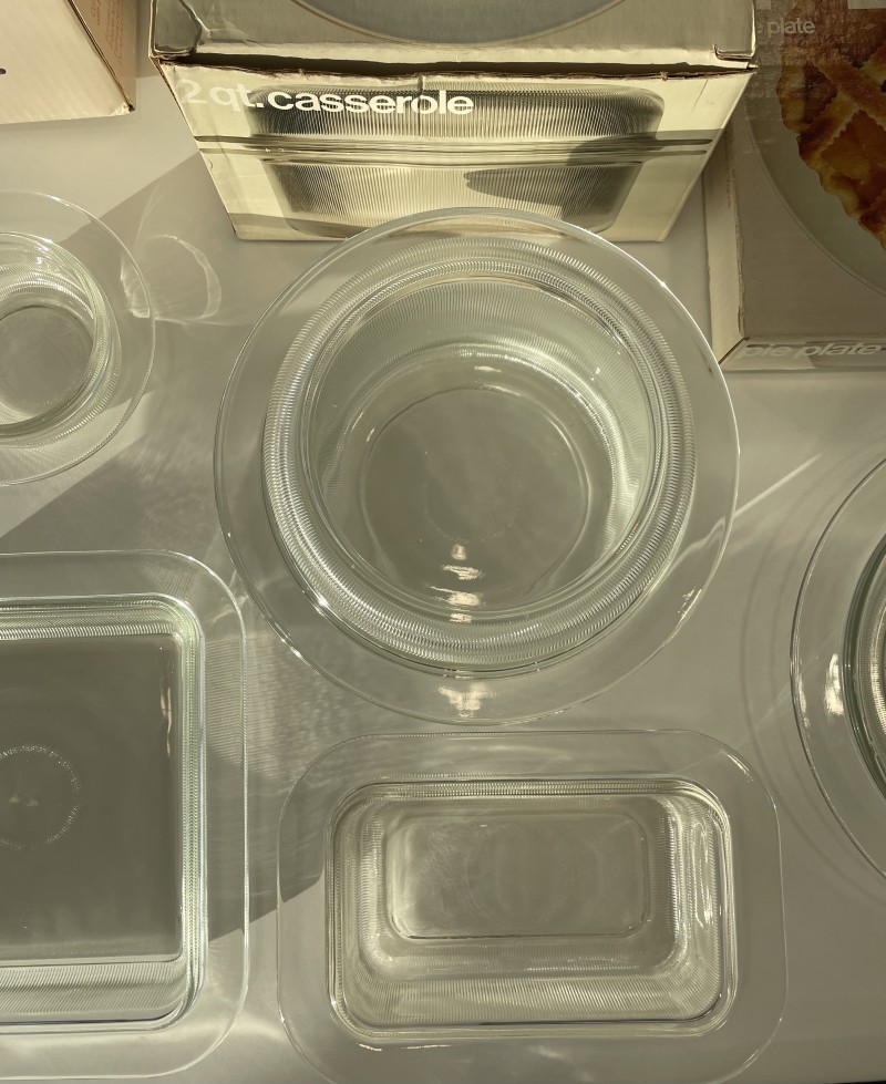
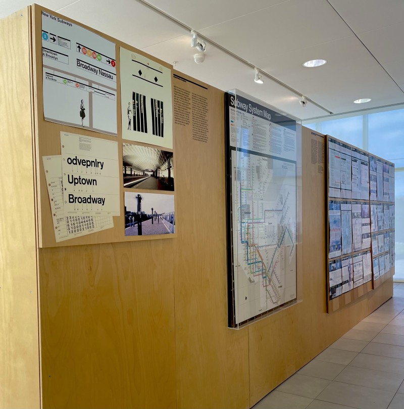
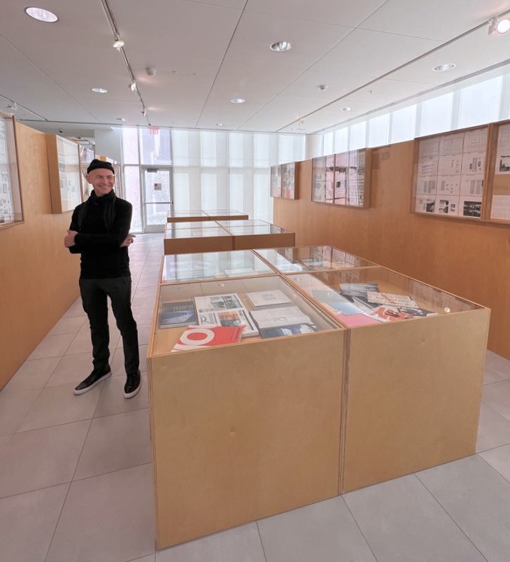
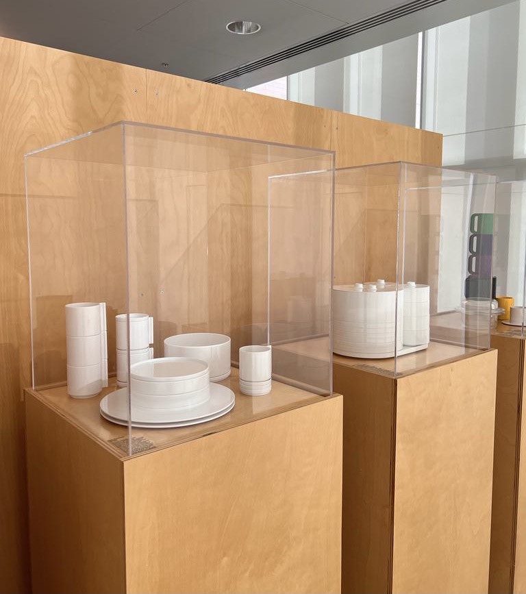
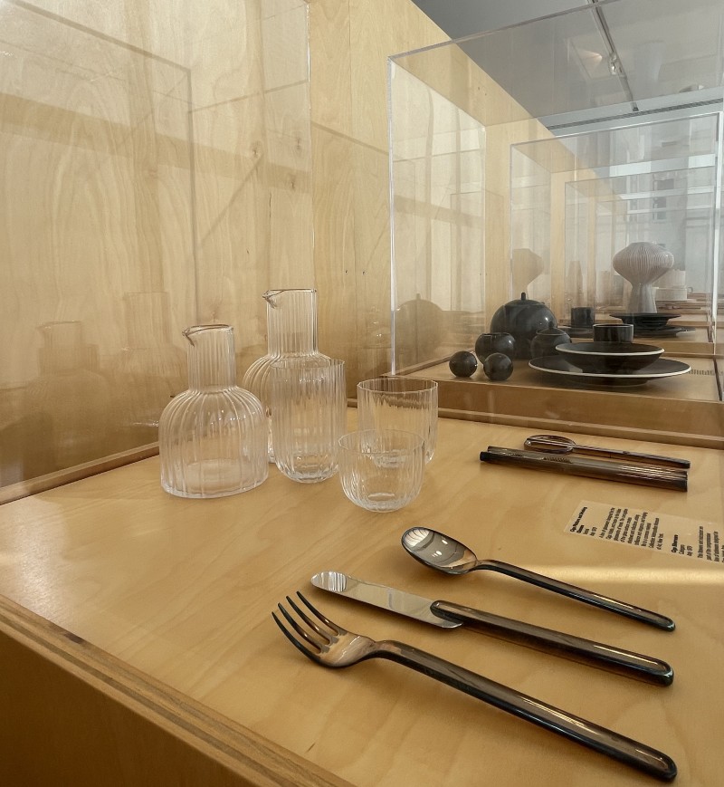
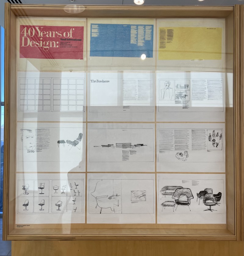
This morning we met up with Josh Owen again at RIT. He gave us a private tour of the galleries and archive at the Vignelli Center before the workshop. The archive features over 500,000 artifacts of Lella and Massimo Vignelli. Highlighting the work by the Vignellis is the Benetton Gallery. Divided on two floors the Gallery displays some of their most famous work, as well as many unique artifacts open to the public. We started on the ground floor of the Benetton Gallery. Mainly graphic works and products are exhibited here, such as the New York Subway Map or the packaging program 505 oven/microwave bakeware for Heller, Inc. Not only the packaging was designed by Massimo, but also the glass bakeware was designed by the Italian designer and his wife. The corrugated glass from 1970 breaks and reflects the light in such a beautiful way that it has become one of our favorite pieces. Also fascinating for us were the original sketches of various chairs made by Massimo for Knoll Design. These were published for the fortieth anniversary of Knoll International in 1979. Further we got to see the silverware and glassware for the Ciga Hotels, from 1979. In 1955 Massimo created the Fungo lamp, its design goes back to that of a mushroom, therefore its name. In 2010, Lella and Massimo designed watches for the Swiss watchmaker Pierre Junod, which we were also able to admire in the Benetton Gallery.
It is just really incredible to be able to marvel at all the Vignellis' designs in one place, even more so a place designed and shaped by the couple itself. On top of that, we get a lot of information and personal stories from Josh about some of the objects, which makes it even more special. Even in the hallway leading to the next floor of the complex, you can find more of the Vignellis' work, such as the Stending calendar. Since the calendar first appeared in 1966 it has been in constant production every year.
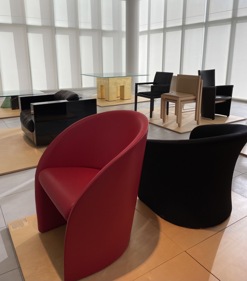
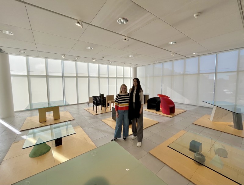
On the next floor, several pieces of furniture were waiting for us. This arrangement of furniture also goes back to the Vignellis, as Josh told us. In the center of the room is an armchair from the Saratoga furniture line for Poltronova from 1964, by Lella and Massimo. In addition, the Casigliani Metafora #1 table from 1979 can be found here, as well as the Casigliani Kono table from 1984. The Knoll Handkerchief chair was designed by the Vignellis in 1982 and is also in the Benetton Gallery, as well as the Interview chair for Poltrona Frau from 1988.
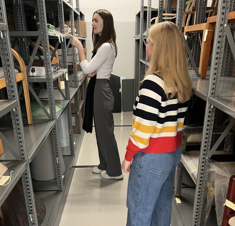
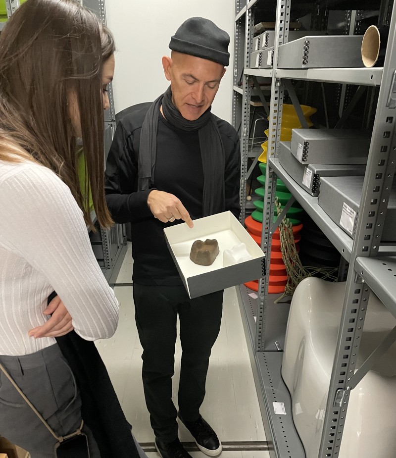
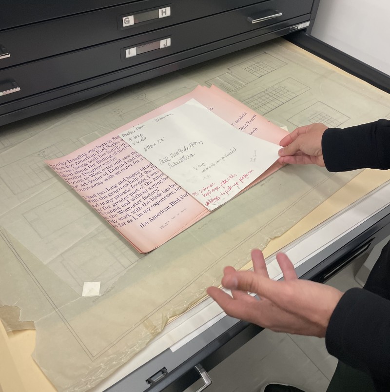
Following Josh showed us into the archives. It was really overwhelming. The shelves are full of the designs and products of the Vignellis, in addition items from other designers can be found in the archive. In total, the Vignelli Center Archive houses 750,000 artifacts that span the entire field of design. More than 200,000 artifacts are objects not created by the Vignellis, but other examples of industrial design, graphic design, furniture, interiors or corporate identity programs, spanning from the 1940s until today. Additionally to finished products, design processes such as sketches, models or photographs are also archived. The Vignelli Center claims that the archive is a place of research and education for everyone. Moreover it should help to inspire people and boost their creativity. “Many of these collections help define and promote Modernism, but some also challenge it and even redefine it.”
After the detailed and very informative tour of the archives and the Benetton Gallery, we headed to the workshop. Again, we started the second day of the seminar with presentations to introduce the students to the topic of light and sustainability, in particular on the aspect of saving and reducing energy. It was important to us that they gain further insight into the topics mentioned and that their sensitivity to them is heightened, as their task consists of designing a sustainable lighting device. Then we also held a really interesting discussion with the students. The topic was sustainable energy, energy consumption, as well as the current situation in Europe, the energy crisis compared to the situation in the US. We shared our personal experiences with the class, for example, how the war in Ukraine is affecting life throughout Europe. We answered questions that were on the students' minds. They also shared with us how they view the situation regarding sustainable energy in the US and what they have perceived so far from the war in the Ukraine. The exchange between us regarding the different experiences and cultures was very inspiring and informative for all of us. Afterwards, the class again had time to continue working on their models and renderings. Since the students will be holding an intermediate presentation to our German team tomorrow, they jumped right into their projects.
.
.
.
By the way, you can take a virtual tour of the Benetton Gallery at the following link:
Vignelli Center Virtual Tour
or visit the digital archive of the Vignellis if you click on this link:
Vignelli Center Digital Archive
Workshop 01 "Light and Liminality" Day 1
Now the day we have been preparing and looking forward to for so long has finally arrived: The first workshop of the "Future Design Embassy" is happening today.
With our rental car, we made our way to the Rochester Institute of …
Now the day we have been preparing and looking forward to for so long has finally arrived: The first workshop of the "Future Design Embassy" is happening today.
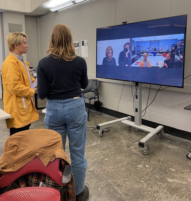
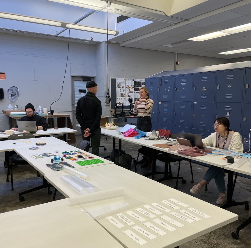
With our rental car, we made our way to the Rochester Institute of Technology. There Josh Owen was waiting for us in his office in the Vignelli Center. After a short espresso break, we headed over to the Industrial Design Department, to our workshop room. In addition to the nine master's students participating in our workshop, Alex Lobo (Graduate Program Director, Industrial Design), Lorraine Justice (Dean Emerita, Professor) and Juan Noguera (Industrial Designer, Educator) were already there. Due to Zoom our German team was able to be present as well. Then we started with our presentations. First we introduced ourselves and gave the students a short insight into our academic career until now, then our team in Germany introduced themselves to the students. We also presented our university, the Folkwang University of the Arts, as well as the different departments of the university and the studios and workshops. Next we introduced the workshop in general, which explores the relevance of Modernist ideas in facing the challenges of the 21st century, reflecting the ethos of Massimo and Lella Vignelli as Italian/ American designers and Ingo Maurer as a German designer and their ideas of good design. In order to better understand the designers, their working methods and intentions of their designs, a presentation about the Vignellis followed, as well as about Ingo Maurer. The goal of the workshop is for the students to reflect on the ideas of the 20th century in terms of their own confrontations with today’s challenges, such as the energy crisis (a real threat in Europe) or global warming (a real threat in the world), and turn them into a product.
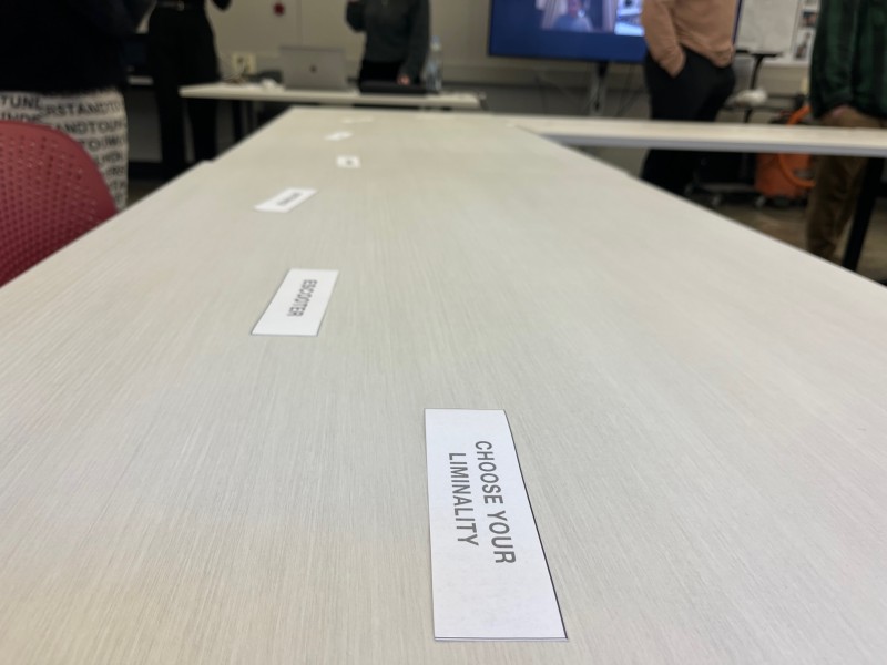
The title of the workshop “Light and Liminality” limits the context to the question of what the light is there for. Liminality is the place of transition, e.g. entrances, passages, garage to house, etc. The students were then asked to get into two teams and choose a liminality, either from liminalties we prepared or choose a liminality of their own. Our idea behind the teams of two is that one student will be more involved in the Vignellis' design approach and the other one more involved in Maurers' design approach. Relatively quickly, the teams got together and debates around the liminalities began. The first team consists of Shen Liu and Zaheer Shujayee, they want to focus on the liminality “way home”. The next team is formed by Tayo Oke, Robert Deane and Jos Mayo. They have chosen the liminality “train station”. Ariella Knight and Jayden Zhou make up another team that wants to focus on the liminality “transition from pain into no pain”. Jacqueline Qiu and Anqi Zhu build a team, concentrating on the liminality “getting out of bed”.
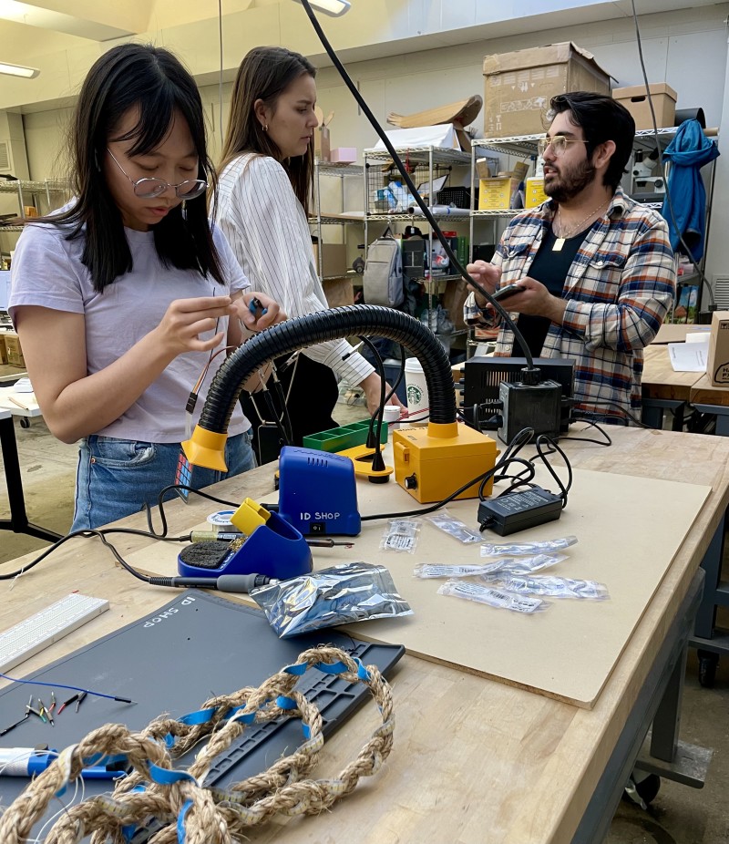
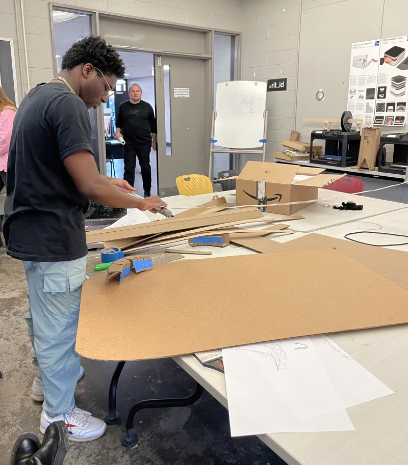
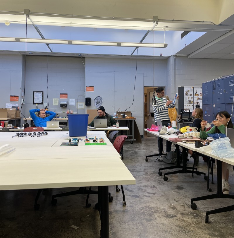
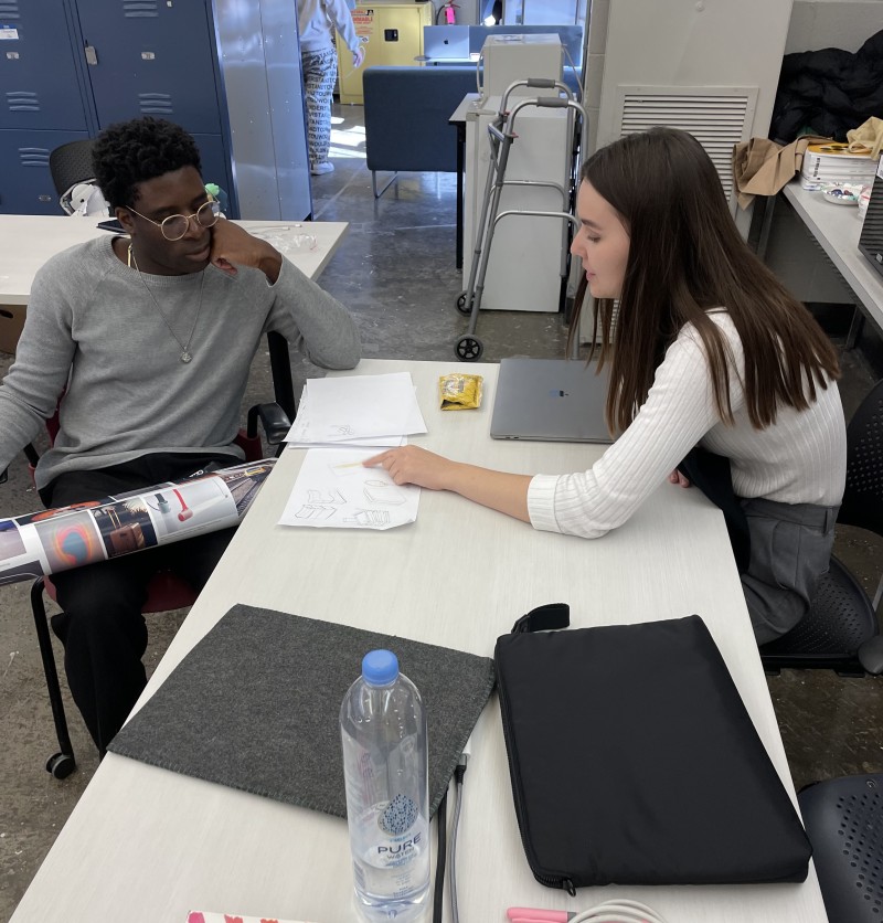
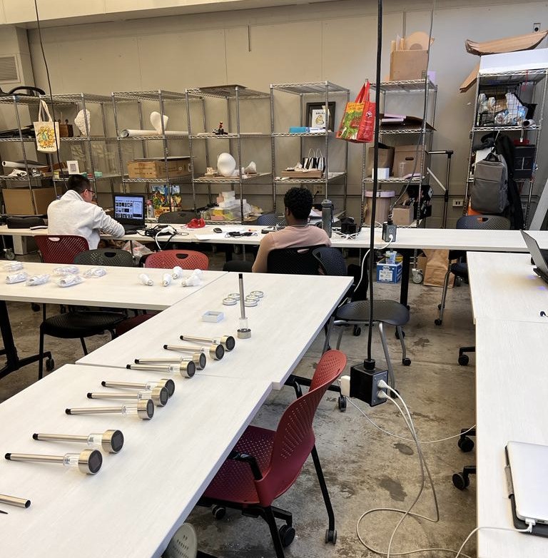
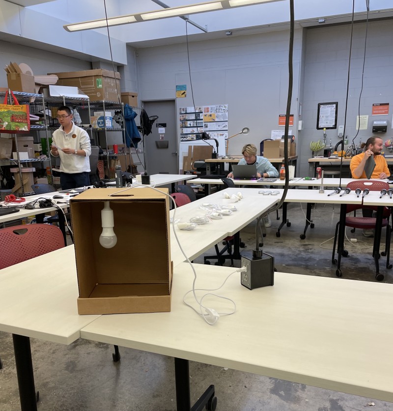
The rest of the day was for the students to freely experiment and work with materials we ordered specifically for the workshop, as well as with materials provided by RIT. When the students had any questions or asked for guidance, we were happy to help.
